Measuring the success of your website and content is critical to the long term success of your business. Few solopreneurs go beyond some simple basics. Where do you find the time?
How do you know where to get reports and which analytics matter? How can you NOT waste time searching for and looking at “cool” (but meaningless) information?
Google Analytics is the “where.” Go beyond the few simple basics you ask of this powerhouse. This article shows you which reports get THE most useful information you need to grow your business, how to get them in the most time-efficient way possible.
If you haven’t already, sign up for a free account with Google Analytics, a completely free suite of website monitoring tools and reports.
When you enter your site information, Google Analytics (GA) will provide you with a snippet of code to embed throughout your site (usually in a Header area that’s constant). Or, if you’re using a CMS like WordPress or Drupal, there are plugins and modules you can install and connect to your account for ease of installation.
For the rest of this article, we’ll assume you have a connected account and can view all of the reports and data indicated. We will assume that you’re using the desktop version of Google Analytics, as that provides the most comprehensive access to reports.
You can certainly use GA on mobile, and even use the official Google Analytics app [Android | iOS]. Other apps, like iDashboard [iOS], are also convenient for much of the day-to-day monitoring you’ll want to do.
OK, ready to get THE Core Reports recommended for daily viewing, rounded out by THE most important Additional Reports? Before we do that, let’s review some Basic GA Definitions and Navigation points so that we’re all on the same page.
Ready?
Basic Google Analytics Definitions
These are some of the basic terms and phrases that you’ll see throughout Google Analytics. It’s important to understand their meanings and differences.
Sessions — A group of interactions (ex., clicks on various links and buttons)_ by a visitor to your website. It ends after 30 minutes of inactivity. Think of a session as the “container” for the actions a user takes on your site. (learn more).
Users — How many users viewed or interacted with your site.
Pageview — An instance of a page being loaded (or reloaded) in a browser.
Bounce Rate — The percentage of total sessions that are single-page sessions (i.e.visitor left your site from the entrance page without doing anything except read some portion of that page).
Navigating Google Analytics
The basic structure of GA is far simpler than you might imagine. You select from an available report in the left sidebar, and view the report to the right. Most reports are tables of data, also displayed on a graph with X and Y axes, like this, followed by a table of break-down data…
The graph usually plots aggregate data points from its following table, according to your selected differential period.
Or, to put it in everyday language (which — don’t worry! — we’ll do all through this article), you can choose Daily, Weekly or Monthly and see how the totals from whatever report you’ve selected look in a graph.
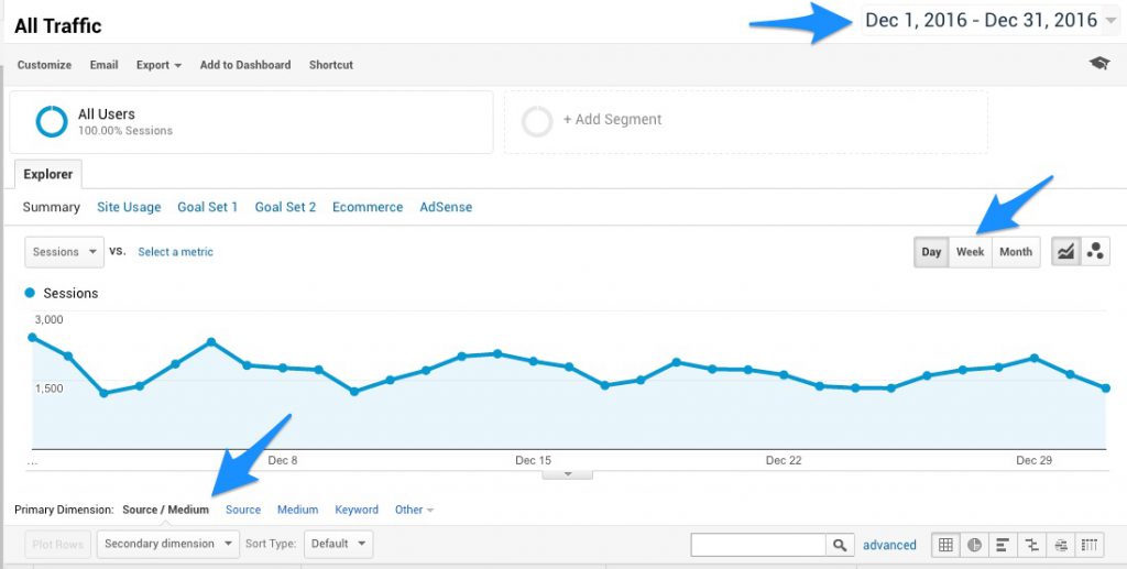
In the upper right-hand corner, you’ll find the date range for which GA will display data. Choose a custom period (such as a particular month) or set your own dates. You’ll also see a tick box to compare one period with another.
Once you select a date range (anywhere from one day to years of data), that selection will carry through as you select and drill down into different reports.
Below the date range you’ll find the buttons for Day, Week and Month to determine which data is charted.
Underneath the graph are two aspects found on most reports: Primary Dimension and Secondary Dimension. These “dimensions” are characteristics of your data, like City or State. Each row represents a dimension and the columns therefore are the associated metrics.
- Primary Dimension is the selected report’s main characteristic, like “Source / Medium” (we’ll talk more about what these terms and dimensions mean in a moment).
- Secondary Dimension is an optional attribute that you can apply to the report, creating additional rows that report metrics and relationships between both attributes.
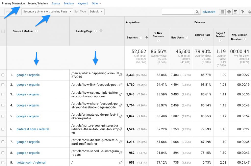
For instance, you could look at a report like Source / Medium which shows the kinds of sites that your website traffic has come from (e.g., Google / Organic), and add a secondary dimension for Landing Page to see where that traffic went from your top sources.
We’ll see more specific examples of when it’s useful to use these attributes as we get into specific reports.
Standard reports are grouped into categories along the left sidebar, with subgroupings under them.
Audience — These reports help you to understand who your audience is, by providing insights into their technology, demographics and more.
Acquisition — These reports help you to understand when your audience visited and where they came from. Discover traffic levels and trends resulting from search, social and referral links from other websites.
Behavior — These reports help you to understand what your audience did once they arrived on your website. Learn which pages were viewed, for how long, and where they went from there.
Conversion — These reports help you to understand how your site performed by measuring what pre-determined site goals were completed, such as signups or purchases.
The tabs above those — Dashboards, Shortcuts, Intelligence Events and Real-Time — aren’t core considerations. Don’t miss our question at the end of this article.
Now that you know your way around the most important parts of Google Analytics, let’s dive into some specific reports.
Core Google Analytics Reports
These are the reports to review regularly.
Overall Site Traffic
This is the report that’s going to give you the earliest indication that something is either going really well or really poorly, so get into the habit of checking once a day normally (more often if something interesting is going on).
You can look at yesterday’s traffic overall, as well as so far today. If you tend to always check around the same time of day, you’ll begin to get a sense for how much traffic your site normally has by a certain time, and be even more acutely aware if something is outside the norm.
For instance, I take a quick glance at my traffic stats early every morning as part of my routine. I quickly see how yesterday finished up and how the morning so far is going. Most days I’ll see a couple thousand visitors the previous day, and 400-600 visitors by early morning.
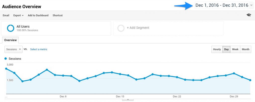
When you first load Google Analytics, the default report is always Audience Overview for the past 30 days, ending yesterday.
You can adjust the time period to whatever range you wish, up until and including today. Here’s what my personal site looked like for December 2016:
It won’t take long for you to learn exactly what “normal” looks like for your site, so that unusual peaks or valleys in the traffic levels will stand out.
Here’s an example. Last October, I helped break the news that Twitter was shutting down Vine. Interestingly, since most social sharing is done via Facebook, Twitter, LinkedIn and Google+, and those audiences tend not to use Vine, I didn’t get an immediate impression that the article was popular. It simply wasn’t being shared to the degree I normally see.
But when I glanced at my traffic statistics that day, it was a completely different story.
3,564 sessions the first day, and 9,454 sessions the next, mostly from Google Search. And that continued (at a lower pace) into January when the service was disconnected.
Not only did Google Analytics alert me to the wild success the article was having, I was able to leverage that information to make some adjustments and additions to the article to help it rank even better.
Where Your Traffic Is Coming From
Understanding where your traffic is coming from is our next target. Again, most days, this is something that you’ll simply review for reference until one of two things happens:
- You spot an unusual spike or trend (like suddenly getting hundreds of readers from Reddit), or…
- You want to determine how much traffic you get from a specific source.
For both, use the Acquisition set of reports, starting with the Source / Medium report I mentioned earlier.
Source / Medium
Click on Acquisition, then All Traffic and then on Source / Medium to get to the Source / Medium report. According to Google, these attributes are defined as:
Source: the origin of your traffic, such as a search engine (for example, google) or a domain (example.com).
Medium: the general category of the source, for example, organic search (organic), cost-per-click paid search (cpc), web referral (referral).
Source/Medium is a dimension that combines the dimensions Source and Medium. Examples of Source/Medium include google/organic, Pinterest.com/referral, and newsletter9-2014/email.
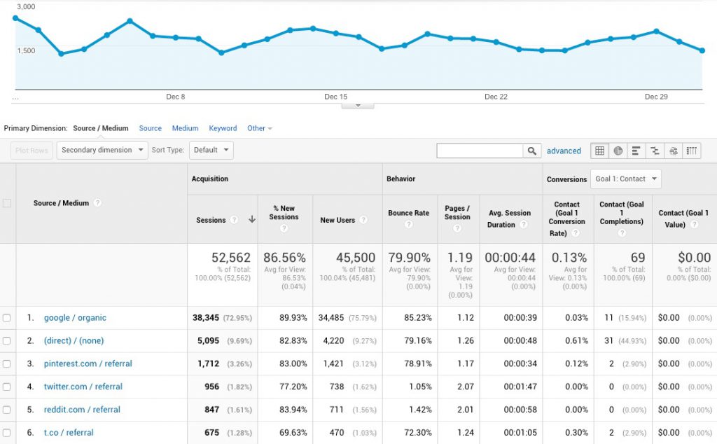
This report therefore is your best, first indicator of how your site traffic is doing with regard to search and social. Not only can you see how well each particular source is performing, you can also compare against the others.
In this example you can see that Google / Organic continued to be my #1 driver of traffic in December, and that Pinterest and Twitter were my top social sources.
To learn more about a particular source in your report, click on it and then add a secondary dimension for whatever else you’d like to know.
For example, if you want to see what your top ranking pages are for Google Search, click on google / organic and then add a Secondary Dimension for Behavior -> Landing Page.
In my case, it’s unusual for Pinterest to refer that much traffic to my site, so it piqued my interest. Adding a secondary dimension of Landing Page showed me that a lot of that traffic was going to a specific article I’d written about the Pinterest app Tailwind, and as it turns out, they’d put some money into a Pinterest ad campaign to promote that pin.
Referrals
The other critical Acquisition report is Referrals.
Click on Acquisition, then on All Traffic to get to the Referrals report. According to Google:
Referral traffic is the segment of traffic that arrives on your website through another source, like through a link on another domain. Analytics automatically recognizes where traffic was immediately before arriving on your site, and displays the domain names of these sites as the referral traffic sources in your reports.
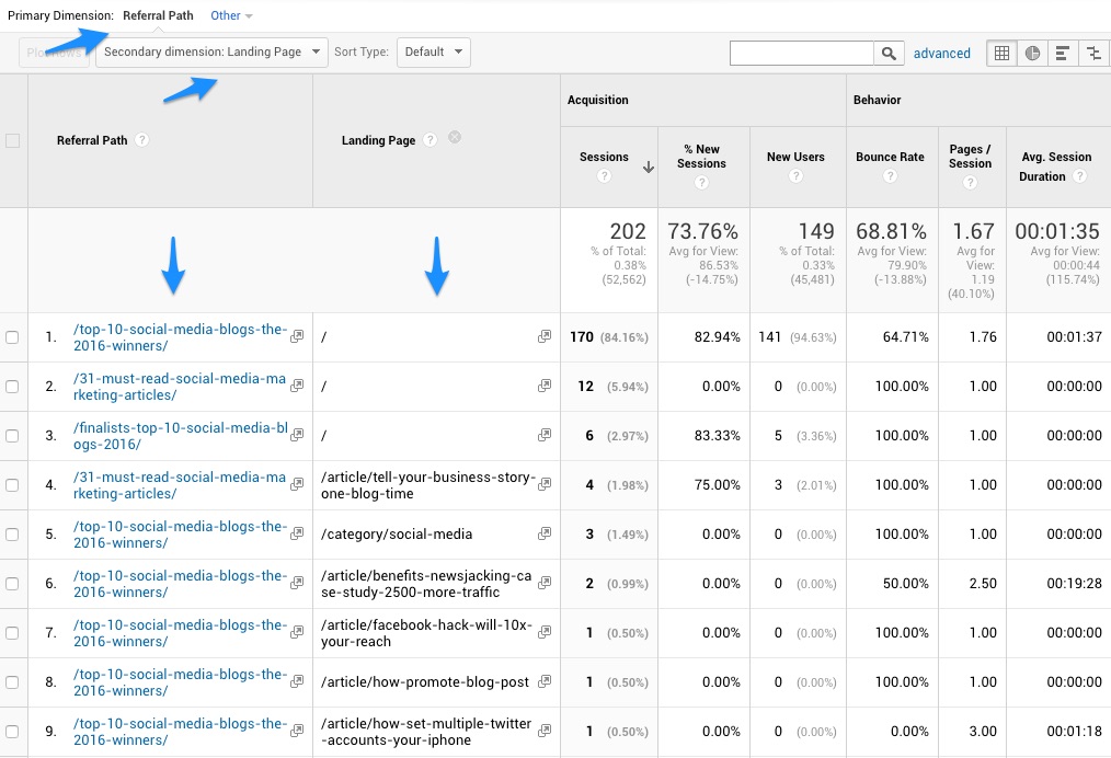
So this report will show you the list of specific sites that have linked to you and sent traffic to your site. Just as with the Source / Medium report, you can click on a specific result to drill down and add a Secondary Dimension for Landing Page to see where those clicks went.
Here, you can see traffic from a few different articles from socialmediaexaminer.com to several different URLs on my site. Often, other people will create links to your site without your knowledge, so it’s good to be able to see those and track them back to the source.
Sometimes those links will be from prominent sources or influencers whom you’ll want to thank and pursue a relationship with, and other times they will be potentially toxic links to be disavowed. (Google looks at every backlink to your site, whether it’s from a reputable site or not, and ranks accordingly. If you get a link from a site that could potentially harm your ranking, you can tell Google you have nothing to do with that link and “disavow” it in Google Search Console.)
Note that “/” indicates your home page.
With the Source / Medium report and Referrals report, you will be able to see where your traffic is coming from and see whether those levels are improving over time. Clicking on any individual source will show you that source’s performance over time in the graph.
Use these reports to monitor the success of search engine optimization, social media marketing, guest blogging and other traffic-building tactics.
Where Your Traffic Is Going
Now that you’re familiar with how people are finding your site, it’s time to dig into what they’re doing once they get there. For this, there are two reports and areas that we want to regularly look at and consider:
Landing Pages
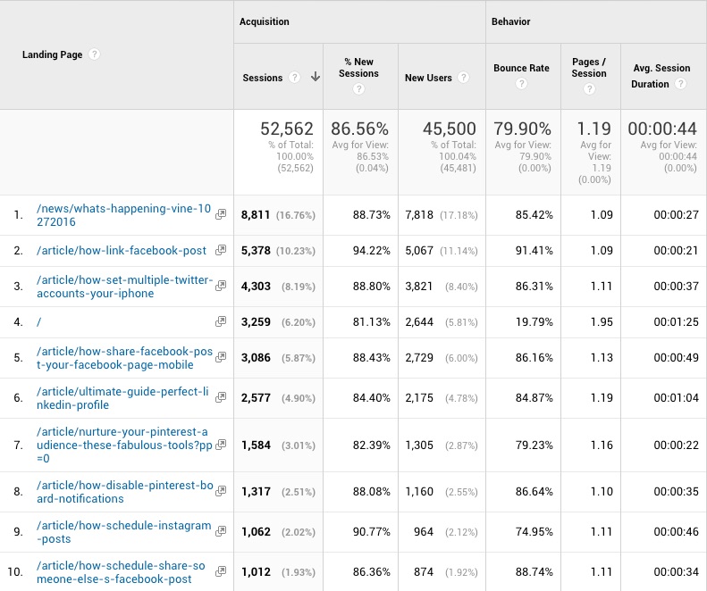
Click on Behavior, then on Site Content to get to the Landing Pages report. The Landing Page is the page on which your visitor “lands” or enters the site.
For most, your home page will be at or near the top of the list, but what’s more interesting is all the other pages that lead people to your site. For a high-performing theme-based content site, these URLs will represent your highest ranking evergreen content pages.
In my case, the results are a mix of recently trending news stories (e.g., Vine closing) alongside well-performing guides and articles. (You’ll get used to reading URL “slugs” -— the text in a page’s address that comes after your root domain name — when looking at these reports.)
As with most reports, they’re automatically sorted by Sessions high-to-low, and you can click through to the next page of results or change how many results are shown. You can also click on any of the column headings to sort by the value instead.
Bounce Rate — The percentage of page visitors whose visit was comprised of a single page session (i.e., they clicked “Back” after seeing your page).
Pages / Session — The average number of pages each visitor viewed during that session.
Avg. Session Duration — The average amount of time each visitor spent on your site during that session.
Combined, these three metrics help you to understand how beneficial a particular piece of content was for your site beyond the initial traffic numbers. Generally speaking, pages with low bounce rate, high pages / session and session duration (time on site) are best.
It’s also important to get a sense for how particular kinds of content perform in these areas. The kinds of posts that I typically write tend to answer very specific questions, therefore they tend to receive a high bounce rate. But because visitors spend some time on those posts, and because they probably tend not to need to click on a second result in their search, my articles rank well for those questions.
The key takeaway here is to monitor how individual pieces of content perform and determine whether that performance is outside your normal expectations. If a page was designed to be part of your sales funnel, yet has a high bounce rate, you may want to revisit that page’s copy.
All Pages
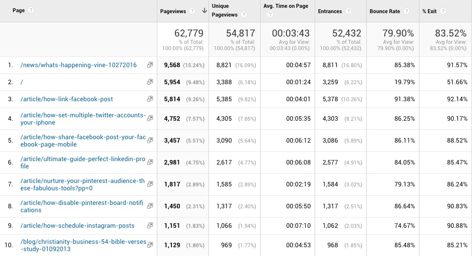
Click on Behavior, then on Site Content to get to the All Pages report. This report gives you an understanding of the total number of pageviews for each page of your site, not just the landing page sessions.
So this combines entrance pageviews with any other pageviews a visitor might have generated while clicking around your site.
The results tend to look very similar to the Landing Pages report, of course, with some additional pageviews added on for those who find some of your content after entering differently.
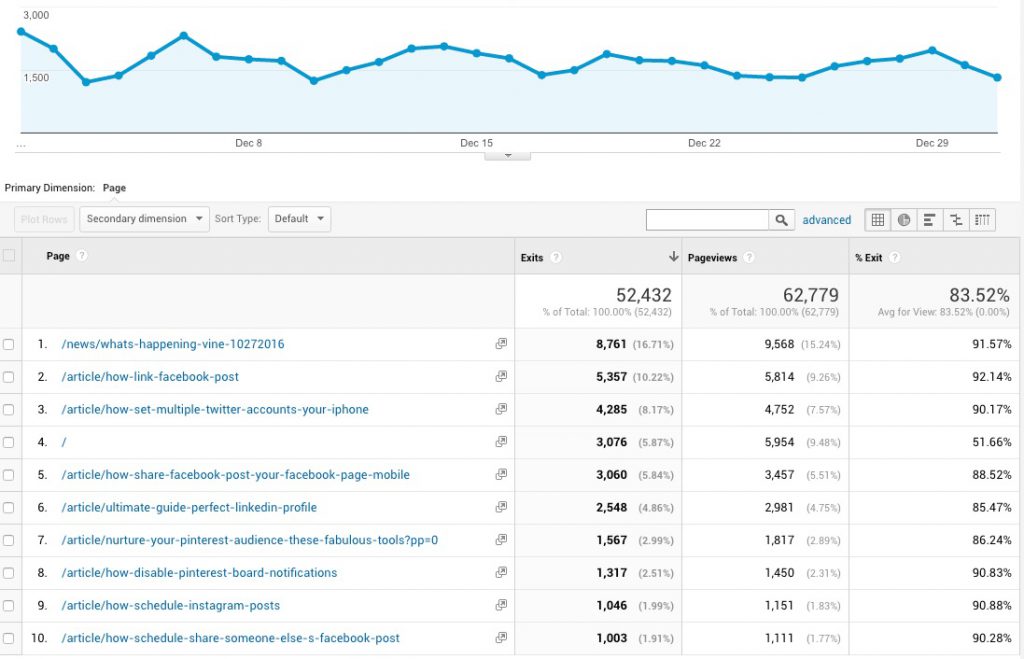
Note that this report also includes a % Exit column which shows you the ratio of visitors who leave your site from that particular URL. This includes those who enter and leave immediately (bounce) as well as those who end up on that page after entering elsewhere, and then leave.
This is where I’m able to monitor not just how evergreen articles are doing from search, but also the effectiveness of internal buttons, hello bars, links, exit intent pop-ups, Twitter Direct Messages and other techniques that I employ to keep readers clicking through to other content throughout my site.
What Your Traffic Is Doing
Finally, monitoring bottom line business performance is critical, and for most businesses, Google Analytics can be easily set up to do that, using Goals.
A Goal is a desired action taken on your website, and is typically keyed to a specific URL. For example, to measure email subscribers, you’d set up a Goal within Google Analytics for the Thank You page those subscribers see. If you sell products through your site, you can measure purchases, giving you a snapshot of your site’s performance at any given time.
Setting Up Goals in Google Analytics
While we will go into more detail at a later date regarding all of the nuance and options available when it comes to setting up Goals, a brief overview is appropriate here.
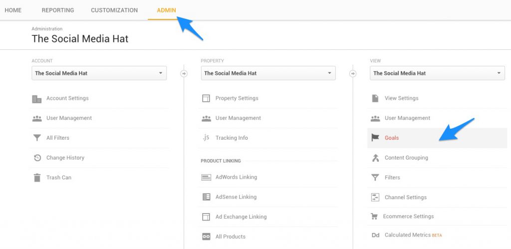
Click on the Admin tab and then on Goals in the View column.
Click on the red +NEW GOAL button.
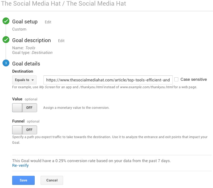
Choose from one of the available Goal Templates, if appropriate, or select Custom. Let’s assume you just want to call attention to visits to a key URL. For instance, I have a Tools page where I list all of my recommended marketing tools, and it’s important enough for me to want to see how that page performs without looking it up in the Behavior reports. Click Continue.
Type in a meaningful name for your Goal. Select Destination as the Goal type. Click Continue.
Copy the URL for your Goal page (in this case, my Tools page) in the Destination field. You can also select whether there’s a defined monetary value to you for this page, and if it’s part of a sales funnel.
Now that Goal will be listed among your other Goals, and will be part of your Conversion reports.
Whether you’re tracking product sales or newsletter signups or something else, you’re going to want to use the Conversions reports to monitor performance. Here are two options to check daily:
Product Performance
If you’ve set up your products within Google Analytics, you can look at a report detailing all of your sales over a period of time, broken down by product. Click on Conversions then Ecommerce then Product Performance.
For each product you have set up, you’ll see the total Quantity sold for the selected period, Unique Purchases, Product Revenue, Avg. Price and Avg. QTY. Using the Search / Filter, you can focus on or omit one or more products to create the report and details you need.
During our successful 2016 Holiday Special, for instance, I saved a custom report that filtered out Solo Build It! renewals and Solo Build It! for WordPress free trial signups, and focused only on paid purchases during the sale period.
Goals Overview
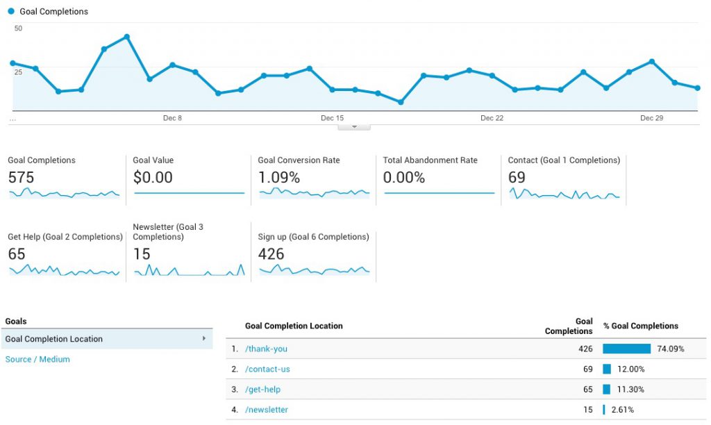
For everything else, the Overview report within Conversions -> Goals is where you’ll be able to track your onsite goal completions.
The report details your total Goal Completions, Value (if you’ve assigned a monetary value to one or more goals), Conversion Rate, and Total Abandonment Rate. That’s followed by a breakdown of completions per goal for each goal that had one or more completions during the given timeframe.
Click on any individual Goal Completion Location to see a graph for that goal exclusively.
The #1 goal for my personal site is to educate readers and ultimately drive them into my email marketing, which I can then use to share new content with them and ultimately monetize. That is reflected by “Goal 6 – Sign Up” for which, after subscribing, they end up on my Thank You page.
Because of the way my MailChimp is set up, with multiple groups and signup offers, this GA report makes it easier for me to see the big picture of how my subscriber base is growing.
Those are the mission-critical reports that you should pull up every day. Over time, you’ll become familiar with your site’s normal traffic levels, where the traffic comes from, and to which articles they’re going.
Which means that, if a particular article begins to rank better and starts attracting more readers, you’ll be more likely to see that and can determine what steps to take.
Which leads us to our next set of reports.
Additional Google Analytics Reports
The following reports will help you expand your understanding of the Who, What, When, Where and How your website is performing, and will prove useful when reviewed monthly or as needed.
Exit Pages
Click on Behavior, then on Site Content to get to the Exit Pages report. This report gives you an understanding of the top pages from which people are leaving your site — either immediately after entry or once they’ve clicked around for a while.
For those pages that have a particularly high Exit %, you might consider spending some time building more links and calls to action (CTAs) within the copy of those pages to get your readers moving through the site.
The report results are automatically ranked by # of Exits, so you’ll see your “most exited” URLs first.
On my site, most of the content answers specific questions, so I expect a relatively high bounce and exit rate. But when looking at specific funnel pages, like my /Thank-You page we mentioned in the previous section, the report lets me monitor the impact of changes I may make.
For instance, when someone has signed up for one of my offers and ends up on my Thank You page, instead of just welcoming them to the community, I’ve tried to give them some “next steps” to follow in the form of additional reading. Over time, I will monitor and enhance those suggestions to bring those new subscribers back into my site.
Demographics
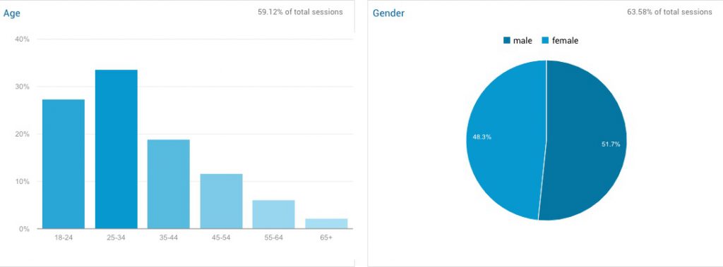
Understanding the Age and Gender of your audience could potentially yield valuable insights into what and how you should be communicating.
Go to Audience, click on Demographics and then Overview. This snapshot clearly shows your breakdown by age group, as well as gender distribution.
In my case, while the gender split is nearly 50/50, it’s clear that my readers tend to be quite a bit younger than I would have imagined. From a content perspective, this suggests I need to use pop culture references that are newer, and other more contemporary examples. More importantly, the data suggests that when I’m creating and targeting Facebook Ads, I might want to consider a younger audience.
Mobile Overview
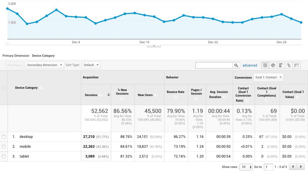
Another report that you definitely need to monitor on a monthly basis is your Mobile Overview. With it, you’ll be able to see the breakdown of Desktop vs. Mobile vs. Tablet users, and make decisions about site UI accordingly.
Go to Audience, click on Mobile and then Overview.
First, look to see if there are major discrepancies in Behavior or Conversion between different devices. You can select different Goals to see how each performed, and determine if more work needs to be done for mobile or tablet users to help them better complete that task.
Second, by monitoring this report on a regular basis, you’ll be able to see whether and when your mobile or tablet traffic is rising or even surpassing desktop.
For me, since I’m watching this report, I saw a 37% increase in mobile traffic in October that continued through November and December. By adding a Secondary Dimension of Source/Medium, I’m able to see that it’s mostly due to Google/Organic referrals, which means Google is ranking some content higher for mobile users.
TIP: When interpreting why desktop, mobile and tablet differ from each other, consider the circumstances of use for each device by your “thumbnail” visitors. For example, desktop is the most “serious” usage, attention focused on what they are doing.
Mobile (smartphone) is largely time that was formerly disposable time (ex., commuting, in coffee shop, etc). Tablets often share time with TV watching, and are used at bedtime. There’s overlap, obviously (ex., both tablet and mobile could be used while eating). Knowing the lifestyle of your audience, especially regarding use of devices, leads to better insights.
Social Network Referrals
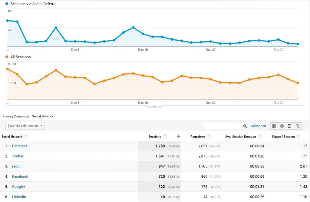
Go to Acquisition, click on Social and then Network Referrals. This report gives you a quick breakdown on how each social networks is performing for you.
It’s quite a bit more convenient than the regular Source / Medium report, which does include these sources, but they’re interspersed among search engines, email and other sources.
Over time, this report will help you identify which networks are improving for you (or not), and how those networks compare to your overall site performance.
Of course, if you’re just getting started reading these reports, it’s good to expand the date range further back so that you can see how the networks have been trending over the past year.
I mentioned earlier that Pinterest referrals were abnormally high for this month. What I’ve monitored over the course of the last few years is an ebb and flow of changing social network prominence. LinkedIn, actually, was once my most important network, followed by Google+.
These days, Twitter remains relatively constant, while Facebook referrals go up and down dramatically depending on the nature of my blog posts in any given month. Because of its stability, I continue to focus on improving my Twitter standing and will use this report, among others, to help monitor that progress.
Campaigns
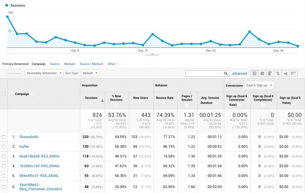
Without going into too much detail, any time a link is created and used in an ad or social share, or placed on another website, you can add parameters to that link which Google will recognize and help to define aspects of that link. These are called UTM Parameters.
Source, for instance, can be defined as a parameter, and the parameter text can be whatever you wish, but if nothing is defined Google will attempt to determine automatically what the Source is.
Campaign, on the other hand, is a parameter that is only noted if you provide it. It’s used to help differentiate between marketing and advertising campaigns, and is very helpful.
In my case, the most common campaigns are emails that I send out, as well as social shares using my social sharing buttons from Shareaholic.
Whenever you want to monitor traffic that comes from a specific tactic or technique, adding a Campaign tag to your link is an excellent idea.
Click on Acquisition then Campaigns then All Campaigns.
Take, for example, Facebook. When you look at traffic to your site from Facebook within Google Analytics, all you see is the total traffic from Facebook to your site or specific URLs. You cannot see which post or share to Facebook drove those clicks. If other people are sharing that content alongside yourself, all of the data is intermingled.
But, if you append your shared link with a Campaign, you’ll be able to see your share’s clicks separately. Just put utm_campaign=Text directly after your link, with no spaces and whatever you want to put in as the Text.
Site Speed
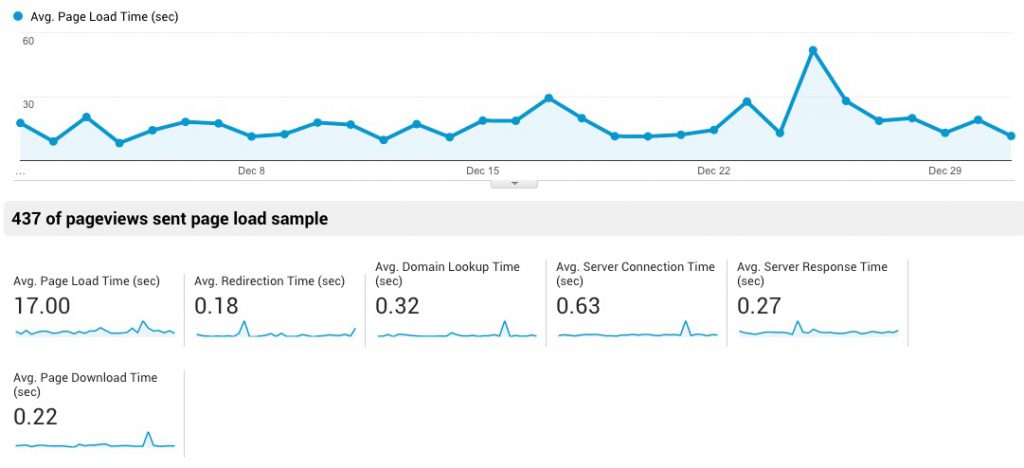
Periodically, it’s important to ensure that your site speed is as good as it could be. Check the Behavior > Site Speed > Overview report once a month or quarter to keep an eye on your speed metrics, as well as after any instance of site upgrades or modifications.
If you begin to see issues (or just want to work on improving site speed for better user experience (UX) and SEO), check out the Site Speed Suggestions report in the same category. (Note that my Avg. Page Load Time is quite poor — 17 seconds — and something I need to work on! Google typically recommends under 5 seconds.)
Only The Beginning? Enough?
We’ve covered THE most important Google Analytics reports for solopreneurs to routinely monitor their online business success and the health of their website. Many solopreneurs get lost in more advanced data, but at the expense of business-growing time.
For many, you’re best off using any more time (beyond what we’ve covered here) actually creating new site content, posting a super photo to Instagram, organizing a special sale for your product(s), etc. In other words, use your time to grow your business.
On the other hand…
As you grow more familiar with Google Analytics, you may find yourself wanting to know more. There’s virtually no limit to what GA can tell you.
The Solo Build It! Forums are a great place to connect with other solopreneurs and get the immediate help that you need. The “Traffic Stats” forum is the best place for questions specifically about Google Analytics.
But if there are other reports or aspects of Google Analytics that you’d like to see covered in more depth, let us know in the comments below. Explain not only what you’d want to do in the most time-efficient manner, but why.
Answering “why” is important because there’s no point to creating a report if you are not going to act on the result. “Why” explains how the report would further your business growth.

Latest posts by Mike Allton (see all)
- How to Avoid Failure in an Entrepreneurial Business - September 23, 2019
- How to Use Buffer for Social Media Management: The Solopreneur’s Guide - September 15, 2019
- Wix Review: An In-Depth Comparison of 10,000 Websites - September 1, 2019


