
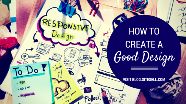
By Kate Wagner Hjorth, Design Coach at SiteSell Professionals
A well designed site draws your visitors into a page’s content, and helps them continue through your content to the most wanted response (MWR) for that page. A poorly designed page distracts them (at best) from your content and MWR. At worst, it sends them fleeing to the Back button.
Great site design is a skill that you can learn. It’s possible to create an overall site design that will look good and lead your visitors to what you want them to do.
Ask yourself, “What kind of topic do I have (playful, business, leisure)? What images do I have and what kind of style do I have in mind?”
It’s from this kind of planning that you get an overall feeling for how you want your site to look. With no planning, you’ll always be searching for the right touch in your design.
Having a design plan will make it much easier to judge which images, text, structure, and colors are right for your purpose.
Here are our top 10 tips for a great design…
1. Keep it simple
Don’t fall into the trap of making your design too busy. In most cases, less is more, especially when it comes to colors and font sizes.
Create a color scheme of a few colors that complement each other. Not sure which colors work together. Check out the Website color schemes: The palettes of 50 visually impactful websites to inspire you.
2. Decide on the MWR for the page
Format each page around the action you most want your visitor to do on that page, aka your “most wanted response” (MWR). Don’t distract them. Guide visitors through the page in such a way that they do what you want while also getting what they came for.
3. Allow your pages to breathe
Keep your pages clutter free.
White space (also called “negative space”) is an underused design tool. Use it to keep your pages and template clean and easy to follow.
The easiest way to add white space is to keep paragraphs short, which is more important than ever now that a large portion of traffic comes via mobile devices (tablets and phones).
A paragraph that displays as an inch long on a computer could easily be 3 inches long on a phone. Chop up those paragraphs so that they each have no more than 2-3 short or medium length sentences.
4. Design for scanning
We want our visitors to read everything we write on our sites, but that hardly ever happens!
Most people scan.
Use sub-headings (H2, H3, and even H4 if needed) to break up your text and make it easier to scan and understand. Also use lists, callout boxes, images and white space to keep your page airy and easy to read. Highlight important words or phrases that you don’t want visitors to miss with bold font.
5. Use CSS to customize your text
You can make your pages more visually interesting by changing little things like bullets into an image that’s appropriate for your topic.
For example, a site about children’s crafts might use a small graphic of a small pair of scissors. A gardening site might use a tiny image of a potted plant. A recipe site might use a small picture of a knife.
Here’s how to make these little, customized images to use for your own special bullet icons…
Create a small image no bigger than 15 by 15 pixels in your graphics app, or in a web-based graphics app like PicMonkey. If you’re using SBI!, upload the image with Quick Upload It!. Go to Special File Manager, copy the URL for the image, and paste it into a text document.
Add this code to the Custom CSS area of Site Designer and save your change…
ul li { background-image: src="[path to file]/image-file-name.jpg"; }
Replace the URL above with the one from the text document.
Are you using WordPress? Upload the 15×15 image file to the site’s Media Library. Copy the URL from the library and paste it into a text document.
Paste this code into your child theme’s CSS file (Appearance > Editor > style.css).
ul li { background-image: src="[path to file]/image-file-name.jpg"; }
Replace the URL above with the one from the text document, and save your change.
There are lots of other small customizations that you can add with CSS. The sky really is the limit.
6. Scan your pages for noise
Noise distracts your visitor. It stops her listening to your message, which is directly related to your MWR.
If you have flashing banners, the maximum number of AdSense ad units, affiliate promotions, links to other sites, or irrelevant pictures on the page, your visitor can become overwhelmed and she’ll click away.
At the very least, she’ll be distracted by your message, and may not do anything other than read and leave.
Busy pages don’t appeal to busy visitors.
7. Make your navigation clear and obvious
Make your navigation obvious and clear. A site with no navigation is like a town with no street names. Visitors will have no idea where they are and will get lost.
Be consistent in the way your navigation guides your visitor around your site.
8. Look at your images
Some topics need lots of images. Others, not so much.
The main thing to watch with images is that they load quickly.
Upload the correct size of image for your planned use (ex., don’t upload an 800×600 image if you know that the maximum width of the content area is 600px—resize the image to 600×450).
Also ensure that all images are optimized for the Web.
Use JPEGmini or TinyPNG or another web-based service to shrink the file size without reducing the image quality. There are also apps you can download and use, such as ImageOptim for Macs.
It’s also important to use the best file format…
- Use JPG images for pictures with a lot of small subtle color changes. Such images will keep a nice composition in the JPG format.
- Use GIF images for high contrast, basic color graphics – charts, solid color drawings, etc. Such graphics will stay clear and bright when used in a GIF format.
- Indexed PNG images (also known as “PNG 8-bit”) can be smaller than either JPG or GIF images. If your graphics application has a PNG 8-bit option, check whether an image file size can be reduced by saving it as PNG 8-bit.Note: Do not save it as PNG, as this file size will be much larger than either JPG or GIF.
9. Be consistent
Pick a style and stick to it throughout your site.
Use SBI!’s Site Designer or your WordPress theme’s customization options to set up everything so that all pages have the same look.
If you need to make changes, use Site Designer’s or the theme’s customization tools so that the changes are applied to every page of your site.
Don’t put borders around your images on some of your pages and not on others. Don’t put different color headlines on different pages. Keep to a pattern so that your visitors can find their way around easily and know what to expect.
10. Don’t confuse
Don’t underline text in your body content. It’s confusing because visitors will think it’s a link. Only show what’s clickable with an underline.
If an image is a link, then make sure it’s obvious that it can be clicked on. This is often done with text, referring to clicking on the image. Or, in some cases, add text to the image itself to indicate that it’s a link.
By using these tips, you can create a design that’s easy for your visitors to use and guides them to your MWR.
Remember…
The best design goes unnoticed. Don’t let a bad design ruin all your efforts to get your Most Wanted Response!
If you need help with your website design, the SiteSell Professionals offer a wide range of services. Check out their website design portfolio for inspiration.
Latest posts by SiteSell (see all)
- You’ve Written an Ebook – Now What? - August 17, 2015
- The Only Five Ways to Monetize Your Audience (Plus One Armageddon Option) - August 7, 2015
- Why Publish on Kindle? - June 19, 2015