Your Business, Beautiful.
Solo Build It! includes over a 100 professionally created site designs for your individual business needs. Start from a stylish pre-designed theme, or use SBI!'s built in tools to customize from a completely blank slate, the choice is yours.
Style it up. Backgrounds, images, fonts, colors.
SBI!'s Site Designer is a powerful, visual css theme editor that eliminates the need to know how to code. Simply click on the element you would like to change, and select your choice using the built in tools.
Select a theme, upload (or create) your logo, and start building your pages.
Want to scratch a creative itch? You can easily change and/or customize any element, of any style, at any time.
And if you happen to enjoy writing your own code, or already have a theme that you designed or purchased, the Upload Your Own module allows you to integrate your styles and pages directly into SBI!'s system.
Options, options, options
Most site builders use a "take it or code it" approach to style changes. SBI!'s SiteDesigner was created to make it easy to explore your creative side. Instead of learning code, you just click on what you want to change, then modify it using simple and familiar tools. But don't let the ease of use fool you, this is an incredibly sweet suite of tools!

Fonts
Over 50 differnt font faces are available to stylize your pages.
Borders
Full control over border widths, radius and colors for each site element.
Shadows
Add some depth to site items: color, position, and blur it, no coding needed.
Positioning
Any element, in any template can be moved, tweaked and placed just so.
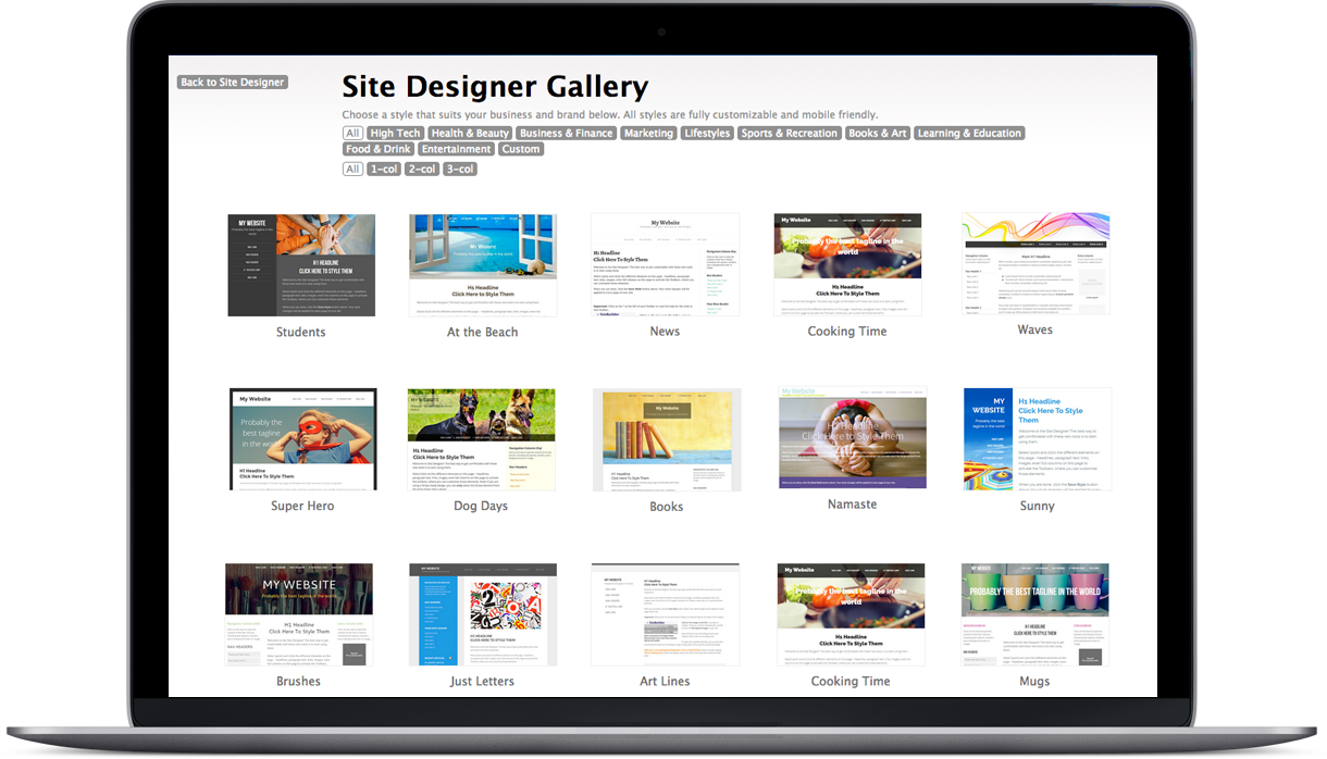
All Shapes and Sizes: Example Sites
Have a look at what is possible - the sites below are a small sample of what is easily do-able with Solo Build It!.
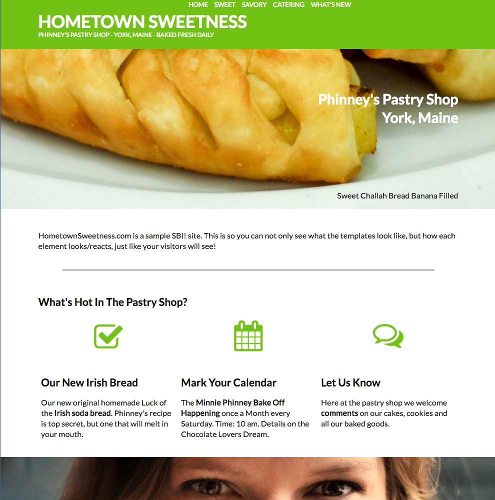
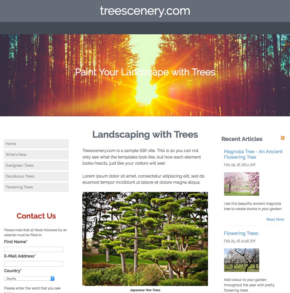
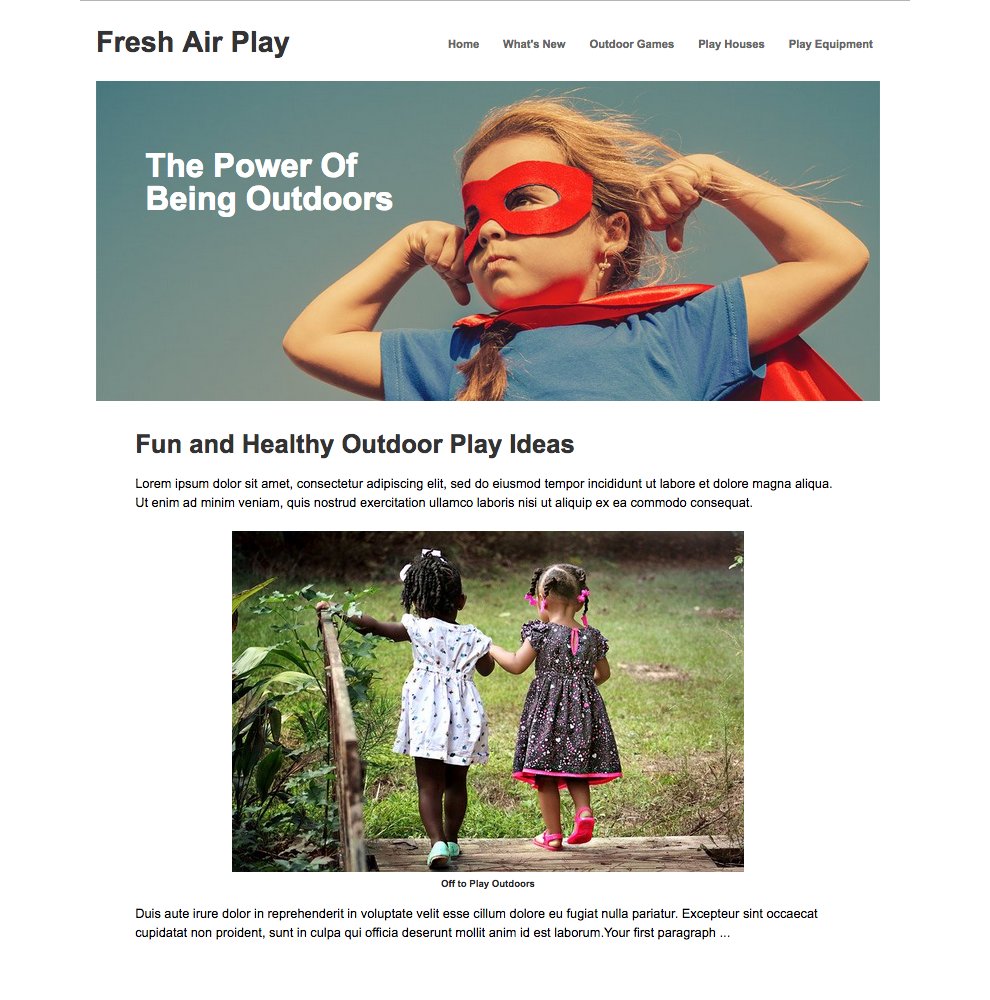
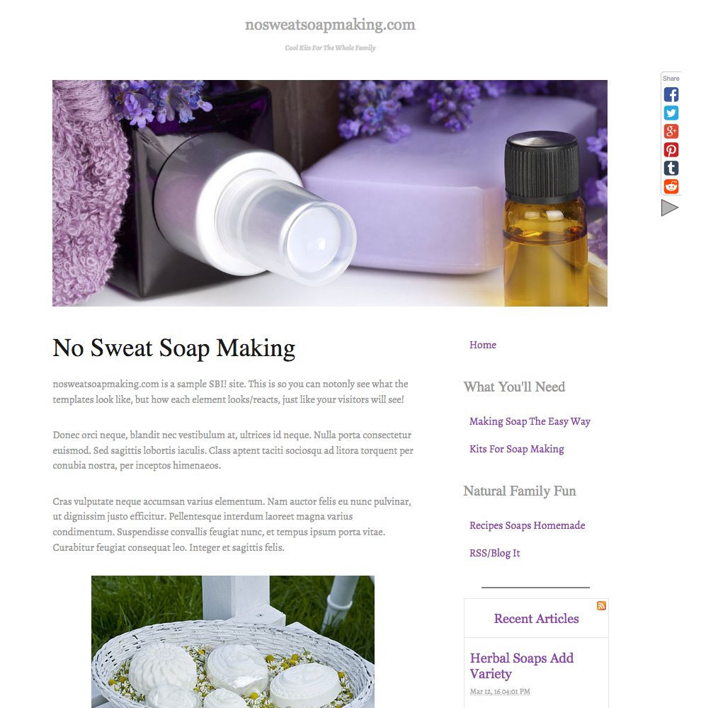
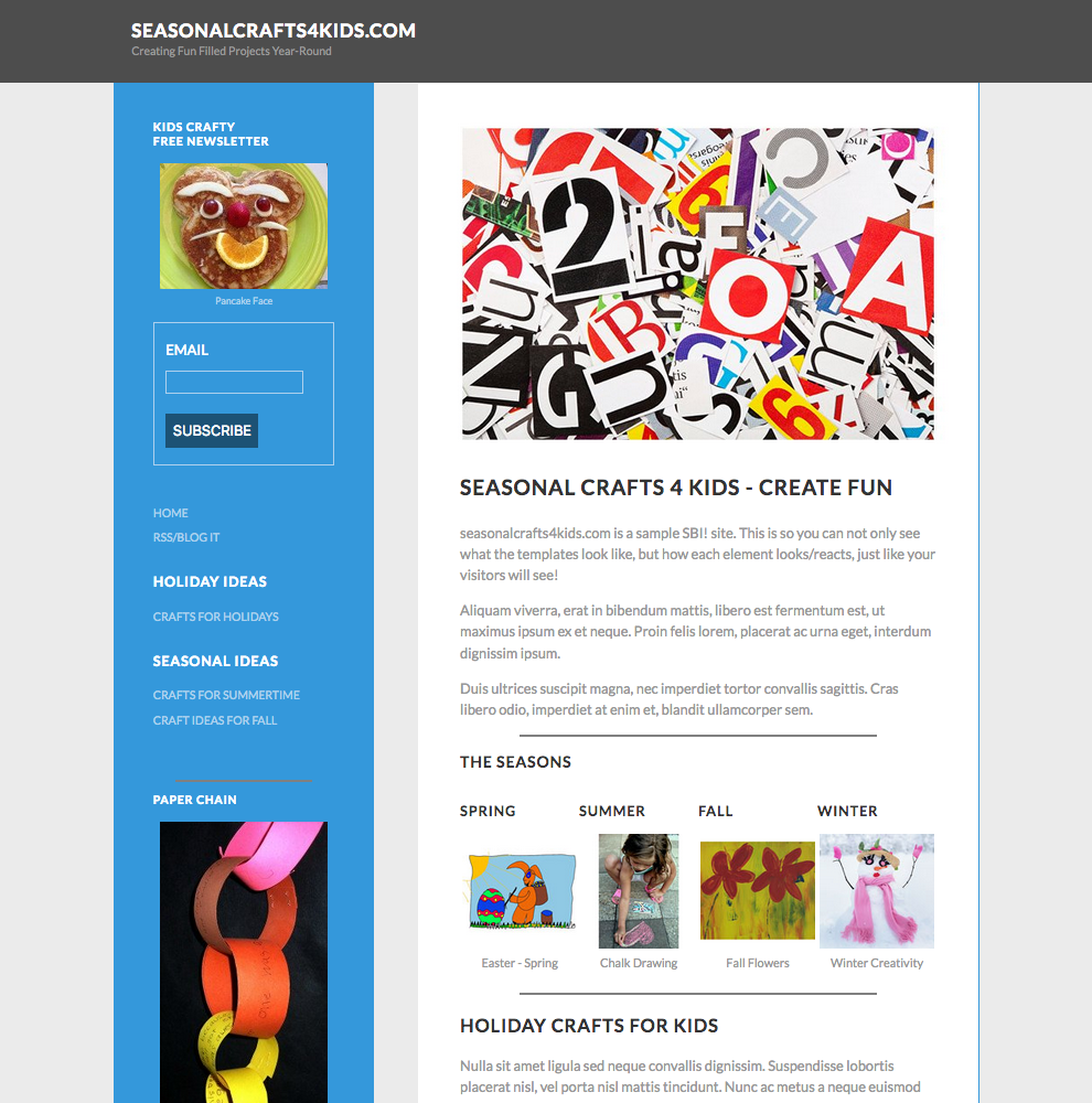
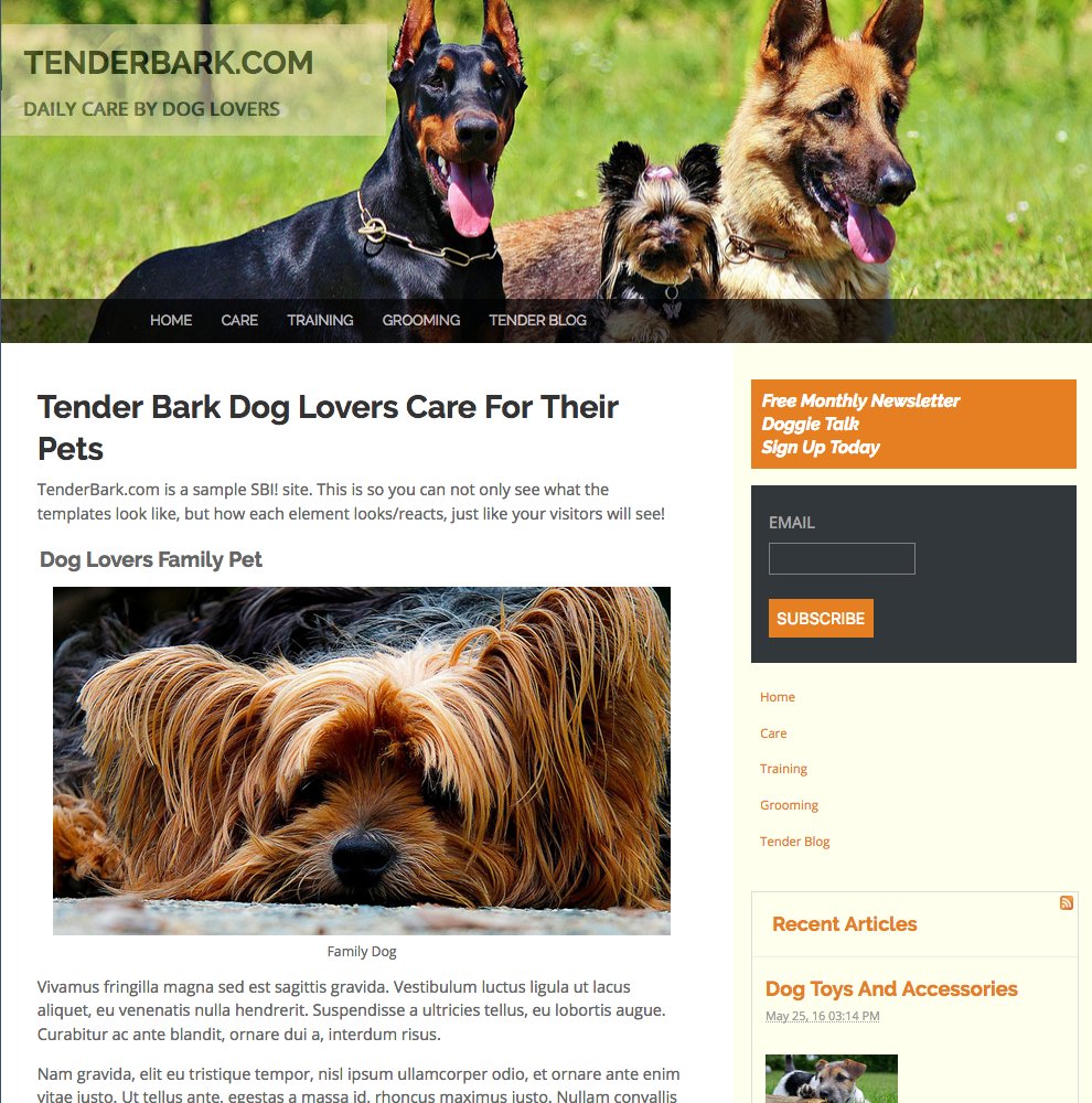
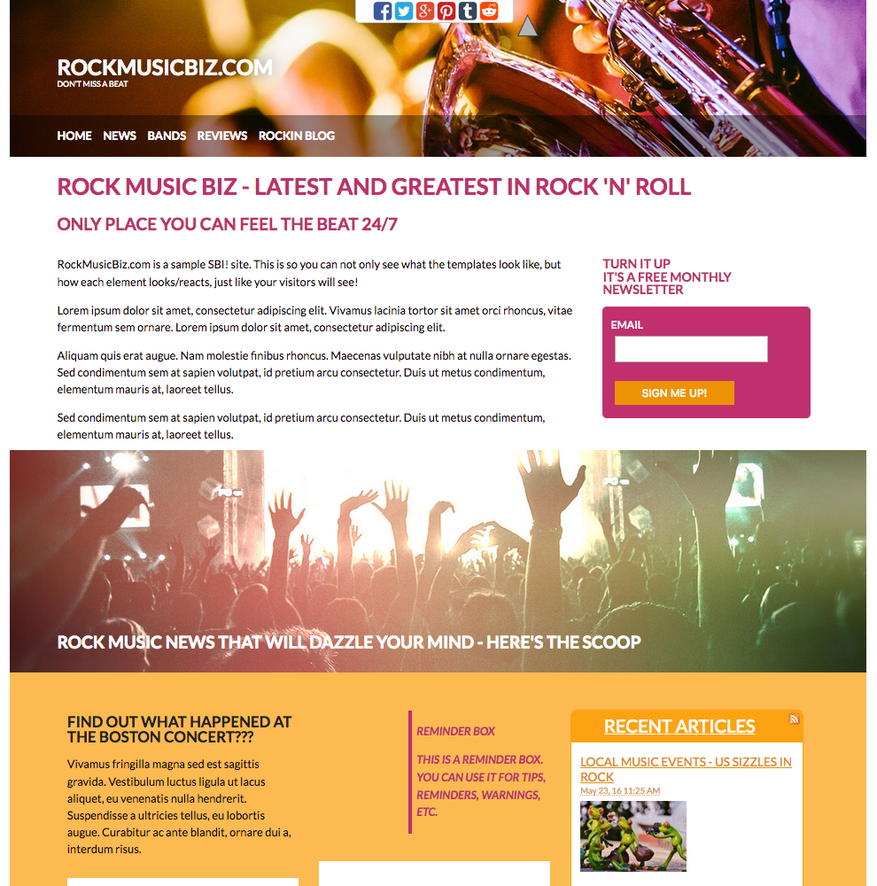
click on a style to see its demo site
Looking Great Everywhere You Look
SBI!'s templates have been optimized to perform well on all devices - computer, tablet and mobile, automatically.
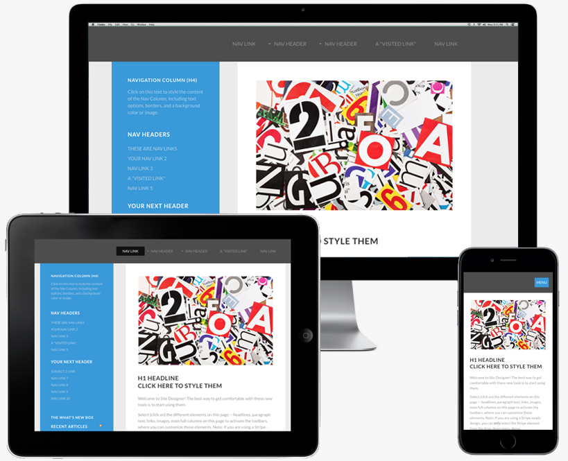
Build it once
The SiteDesigner and BlockBuilder systems adapt your styles and pages to your visitors devices. All responsive features - mobile friendly menu's, image scaling, dynamic page re-sizing etc., are built right in.
There is even a unique option that allows you to specify specific items on your pages (supplemental text, images, extra advertising, etc.) to appear only on certain devices. For example, if you have an ad that you would like to show on a desktop or tablet device, but not on a phone (because it would occupy too much space), all you have to do is click to say so.
No need for you to learn css, or to code device viewports, just click a button and you are done.
Put your best face forward, then focus on your business
As a solopreneur, your time is your most valuable asset. Solo Build It! is designed to allow you to use your time building your business, not straining over ever changing technology. The advantage of an integrated system is that all of the 80+ included modules are updated automatically - there is no need for you to be reasearching or checking for compatibility issues, backup, or reinstall components. Solo Build It! is a maintance free enviornment that allows you to keep you focused on what matters - running your business.

 Try it. Simply follow the Action Guide.
  No strings. Better, actually...