
Do your website visitors take the action you want them to? Do they subscribe to your newsletter, fill out your lead form, or buy your ebook? If not, it’s time to take a critical look at your Call to Action (CTA).
And with Call to Action I don’t just mean a button or link. It’s about the whole “advertisement” surrounding the CTA button or link. That’s what these 20 Call to Action best practices are all about.
What Is a Call to Action (aka CTA or Call-to-Action)?

A Call to Action, in website/online marketing, is intended to motivate the visitor to take an action that gives the site/advertiser the Most Wanted Response (MWR).
A Most Wanted Response (MWR) is the goal the online business owner or advertiser has targeted for a web page or ad.
Why Do You Need a Call to Action to Begin With?
Without a Call to Action, your target market (visitor/consumer) is much less likely to give you your Most Wanted Response.
How Does a Weak CTA Become Stronger and More Effective?

A weak CTA is only slightly better than no Call to Action. But at least it’s a start. A weak CTA becomes stronger and more effective when you include Action Words and Power Phrases within your copy.
What Are Action Words/Power Phrases? Why Do You Need Them?
Action Words are verbs that command action. Active verbs like Click, Subscribe, Join, Contact, etc. bring the attention of the reader to what you want them to do. Use Action Words to entice your visitor to take the action you’ve set out in your Call to Action. Action Words close the deal!
Some examples of Action Words (aka Action Verbs):
 Click
Click- Learn
- Read
- Buy
- Order
- Sign up
- See
- Create
- Complete
- Enter
- Listen
- Subscribe
- Shop
Power Phrases are descriptive phrases that trigger an emotional response. The emotional response helps you to connect with your visitors and guide them to what you want them to do. Power Phrases improve receptiveness to your Call to Action.
Some examples of Power Phrases (aka Power Words):
- Members only
- Studies show
- Lowest price
- Off limits
- Risk free
Smartblogger.com created a list of 7 different types of Power Words you can use to spice up your copy and convert your visitors to your most wanted response. They are:
- Fear
- Encouragement
- Lust
- Anger
- Greed
- Safety
- Forbidden
Breaking these down, here are some words you could use to provoke each feeling:

Fear: agony, beware, caution, crazy, devastating, dumb, embarrass, fail, gullible, injure, jeopardy, looming, meltdown, painful, panic, risky, scary, shatter, silly, stupid, targeted, toxic, victim, etc.
Encouragement: amazing, awe-inspiring, brilliant, courage, daring, effortless, empower, fearless, grateful, hero, honor, classy, unbeatable, unique, uplifting, thrive, surprising, strong, remarkable, phenomenal, persuade, magic, etc.
Lust: captivating, love, arouse, begging, charm, cheeky, crave, desire, embrace, exposed, hottest, intense, juicy, lonely, riveting, intriguing, sneak peek, engaging, compelling, charismatic, tempting, spellbinding, shameless, etc.
Anger: abhorrent, annoying, barbaric, blatant, cocky, corrupt, demolish, distorted, hate, horrid, infuriating, know it all, rant, weak, provoke, agitate, obnoxious, oppressive, punish, ravage, ruthless, scam, slap, underhanded, etc.
Greed: bargain, best, bonanza, cheap, costly, discount, extra, giveaway, instantly, final, value, legendary, successful, smart, genius, exclusive, special, upsell, free, greatest, money-making, deadline, attractive, effective, boost, skyrocket, whopping, etc.
Here are some Power Phrases in the Greed category: don’t miss out, never again, at the top, booked solid, lowest price, marked down, money-draining, money-saving, while they last, sale ends soon, ahead of the game, turbo charge, price break, running out, high-paying, etc.
Safety: legitimate, guaranteed, quality, results, refund, proven, authentic, automatic, backed, privacy, protected, reliable, research, bona fide, genuine, authority, because, certified, endorsed, foolproof, recognized, worldwide, safety, improved, etc.
Here are Power Phrases in the Safety category you won’t want to forget: above and beyond, best-selling, cancel anytime, recession-proof, science-backed, studies show, scientifically proven, money back, risk-free, fully refundable, well-respected, case study, track record, no questions asked, guilt-free, etc.
Forbidden: secret/secrets, backdoor, banned, blacklisted, bootleg, censored, private, restricted, shocking, elusive, unconventional, insane, key, myths, priceless, privy, strange, confidential, classified, unusual, forbidden, forgotten, insider, hidden, unlock, unveiled, etc.
And some Power Phrases in the Forbidden category you need to use: never seen before, off the record, behind the scenes, black market, off limits, become an insider, class full, thought-provoking, be the first, top secret, trade secret, unheard of, invitation only, login required, members only, on the QT, from the vault, hush-hush, little-known, etc.
You can mix and match words within a category, or across categories to entice, engage, and get your visitors moving toward your most wanted response. Then use the Action Verbs (Action Words) to close the deal. Empowering!
Including both Action Words and Power Phrases in your advertisement and Call to Action can turn a dud into a money maker for your site.
For inspiration, check out these 15 Call to Action examples that work.
20 Best Practices for Creating a CTA Your Readers Can’t Help But Click

Before you begin your CTA design, write down your primary and — if applicable — secondary goal for the CTA. For example, your primary goal could be selling your information product, and your secondary goal might be downloading a free sample chapter.
Start simple and grow from there as you test and compare results.
Draft out the CTA on paper (download the free worksheet/checklist!) so you can play with choosing the right words, phrases, and benefits to include and where you want to place them. Make notes of any imagery, colors, and placement you want to try with your Call to Action.
Bullet points are great to shorten sentences into a brief list. This saves room in the ad, highlights the benefits (solutions) you provide, and makes it easy to read.
- Decide what you want the visitor to do (Join, Subscribe, Contact, etc.).
- Use a thesaurus to bring up synonyms for more Action Words, if needed.
- Work through our free worksheet/checklist as you draft your ad.
Run the draft by family and friends who will be honest with you. Is it too pushy? Too wishy-washy? Does it make them want to take the action you’ve asked for in your CTA button?
The idea is to have a draft you can work from that will make creating the final version much easier.
Ready? Let’s dive into the 20 best CTA practices. You won’t find a more comprehensive list anywhere on the Web. Most of them are things a visitor won’t “see” but will — subconsciously — react to.
- Use Action Words to command attention and direct your visitors to take a specific action.
- Add Power Phrases to trigger emotion and connect with your visitor.
- Strike a balance. The more Action Words and Power Phrases you use, the more “salesy” and fake your CTA will sound.
- Use colors for CTA buttons that contrast from your site’s colors.
- Make text large and legible, but don’t overwhelm readers.
- Keep the Call to Action brief. The longer the CTA, the more time it gives the visitor to turn away from your offer.
-
Focus on being clear vs. being clever. Using cutesy spelling, plays on words, etc. is fine, but unless your niche is cutesy and clever, it’s best to leave cute and clever on the shelf. This type of writing will confuse some visitors, and your site will appear unprofessional to others.
Sarcasm doesn’t translate well to text, and humorous insults will always offend someone. You can risk it, of course. Just be aware that you’ll limit your target market if you go in that direction.
-
First person vs third person — “my” vs. “your” — “my” wins.
ContentVerve saw a 90% increase in click-through rate by using first-person phrasing. ‘Start my free 30 day trial’ vs. ‘Start your free 30 day trial’.”Protocol80.com
 Make it time sensitive. Add urgency. Use time-related Power Phrases like Now, Limited Time Offer, Don’t Miss Out, 3 days left, etc.
- QuickSprout.com reported on whether to go above the fold. Nick Patel took a 17% loss in conversions when he put the CTA above the fold. His users wanted to know more about an offer before they would commit to the click. However, each niche and CTA is different. Don’t be afraid to experiment above vs. below vs. multiple vs. using both.
-
Don’t distract visitors from your Most Wanted Response (MWR). When using multiple MWR buttons for different actions, make it easy to see which button rules the page. Avoid putting another button beside, below or really close to the primary CTA button, unless it’s complementary to the primary MWR. If you do, make sure you provide it as a “muted” CTA. Muted could mean muted colors, smaller, etc. so it doesn’t stand out as much as the primary CTA.
Don’t confuse visitors… only have one primary Call to Action for a page and one secondary CTA. There are other pages where you can use other CTA options. You can, and should, use multiple primary CTA buttons and/or links throughout your page or ad (depending on the length of the page / ad). -
When using an opposing Call to Action (OCTA), keep it small and away from the primary CTA. For instance, on exit intent modals or welcome gate overlays, give the reader some way to close the overlay. You don’t want to compete with the primary CTA, so treat it like a secondary, less important feature of the copy.
It’s common to see an “X” in a corner of the modal, or a simple “Close” link nearby. Recently I’ve seen instances where a “No Thanks” or similar secondary CTA is used. Always give the reader some way to exit, even if you don’t really want her to. You don’t have to make it too obvious though. The opposing CTA should not compete with the primary Call to Action.
- Text vs. button? Copyblogger.com reported a 45% increase in clicks for their client just by making a textual CTA look like a button.
- Click Triggers are the emotion-connecting words (Power Phrases) near or as a subtitle on buttons. Indicators, like arrows on the button, are also click triggers. Adding anxiety-reducing text on or near the button, like key benefits, privacy assured, no credit card required, etc., helps to assuage doubts and improve conversions.
- Keep the number of choices small. The more choices you give visitors, the more time they take to decide — or it overwhelms them and they just leave. K.I.S.S. applies here. Our recommendation is 3 or fewer for a web page, and 2 or fewer for advertisements or similar CTAs.
- White space is positive space. Give your CTA space. Let it take center stage, since that’s what you designed it for. This doesn’t mean you have to use “white” as your background. It’s fine to have other than a white background.
- Placement of the CTA is important for getting the click. Keep your CTA within the natural flow of how a page will be read — left to right, top to bottom for English, for example. Call to Action buttons in the lower right of the supporting text create a natural conclusion of a web page or overlay.
- Include an enticing or bold subject (email) or headline (web page) using a question or statement to draw visitors in. If you ask a question where the answer is Yes or No, ask it in a way that the desired answer is Yes. It’s best, though, to ask an open-ended question.
- Finish off with a clear and unmistakable Call to Action. Make it stand out, and tie it into the supporting text.
- Don’t be satisfied. Be hungry! Test! Strive for ongoing improvement of your offer and click-through rate (CTR). You can always do better and get better results, but without testing, how will you ever know?
Why You Need to Test Your CTA

I remember when I put my first monetization code on my first site. Oh, the thrill of getting my first sale! Back then I didn’t care if I only got 1 sale for every two or three thousand visitors, it was a sale! Today, however, I care about my conversion rates. I don’t want to be leaving 30% to 90% of my potential income on the table ever again!
With a newsletter sign up Call to Action, a 1% to 2% conversion rate is common when starting out. But why not strive to double, triple or even quadruple conversions? How? By testing!
Don’t be afraid to test just because the change will result in lost signups or income. If you’re going to be a successful online business owner, open your mind, and learn.
Failure isn’t fatal, but failure to change might beJohn Wooden
A/B Split Testing
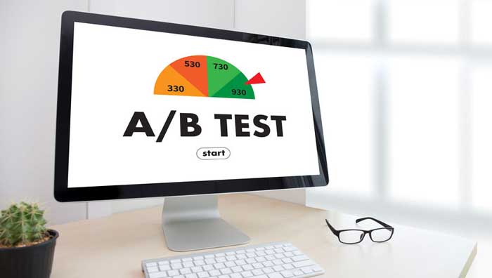
A/B split testing allows you to share 2 versions of the same page with your visitors. Half see the original version (the control), the other half see the second version (the test) during the same time period or view count.
Doing an A/B split test will help you determine which version of the page or ad is better at getting your most wanted response.
Do you have two great headlines and you’re not sure which to use? A/B split test the headlines. Do you think your Call to Action is too weak, or too strong? That’s another opportunity to split test.
Don’t know what to test first? The first test you could run is with family and friends. Not all of them, not even the closest of them. Pick the ones who will be absolutely honest with you. Their feedback can provide you with valuable insight into the elements upon which to start your testing.
Google offers free A/B split testing via Google Experiments – Optimize Resource Hub.
This resource gives ideas and easy-to-follow steps on using Optimize, so don’t be afraid to experiment. Test colors, Call to Action text, buttons, images, photos, etc. as well as headlines, form entry boxes, submit buttons, and more. But test just one at a time! (More on that below.)
If you don’t have enough traffic yet to get 1,000 uniques in a timely manner, consider using inexpensive Pay-Per-Click advertising to drive traffic to your experiment.
What to Do With Your Test Results
Once you’ve run the test using Google’s Optimize Resource Hub, decide which version of the page was better at converting to your MWR. Keep that version of the page (it becomes the new control) and drop the other. Now make a copy of the control, make a different change to the test version, and run the A/B split test again.
Make only one change for each experiment, otherwise you won’t know which element in the Call to Action is doing the best job, and which isn’t.
Just remember to drop the losing version and keep the winning version, even if the winning version is the original page in the test.
Let the Science of Call to Action Best Practices Guide You

I could rattle off reams of stats that back up each of the best practices for Call to Action ads, buttons, etc. but I won’t. I gave you a taste of them, just so you know they’re available and they work.
Now it’s up to you to take action and draft your first Call to Action and advertisement. Yes, even getting signups to your newsletter is an advertisement. So you need a Call to Action for it.
If you’ve been around awhile as an online business owner/webmaster, take some time to review the existing ads for the products and services on your website. What changes will you test to see if you can improve conversions and increase income, subscribers, orders, etc.?
Success isn’t about being the best. It’s about always getting better.Behance 99U
Next, check out these seven strategies for high-converting ads and CTA placements. SBI! and SBI! for WP solopreneurs show you what they’ve done that works!

Latest posts by Debs Seeber (see all)
- 15 Call to Action Examples That Are Proven To Work - January 22, 2021
- 8 Call to Action Examples to Fire Up Your Marketing - June 9, 2020
- 7 Strategic Ad and CTA Placements for Maximum Impact - May 26, 2020
