

In the first two articles in this series, we looked at Call to Action best practices and CTA placements.
Now we are getting to the fun part: from theory to practice. I will show you eight Call to Action examples that can greatly improve your current contact or newsletter signup forms. These are real life examples from successful Solo Build It! or SBI! for WP members. They are meant for inspiration (no copycats please!).
“If you want something new, you have to stop doing something old”Peter Drucker
Before we dive into the examples, let’s do a quick recap of the 20 CTA best practices that I had outlined in the first article. Remember that you don’t have to use all of them, but they are a great starting point.
- Use Action Words
- Use Power Phrases
- Strike a Balance
- Contrasting Colors for CTA Buttons
- Large, Legible Text
- Keep It Brief
- Focus on Being Clear vs. Being Clever
- 1st Person
- Add Urgency
- Above or Below the Fold, or Both?
- Reduce Distractions
- Keep Opposing CTAs Secondary to Primary CTA
- CTA Buttons Outperform Textual CTAs
- Use Power Phrases On or Near CTA Buttons
- Keep Choices Low
- White Space
- Placement of CTA Buttons
- Use Enticing or Bold Subject or Headline
- Always Finish with a Clear and Unmistakable CTA
- Always Test, Retest, Test Again, But TEST!

Now, on to our Call to Action examples. Let’s start with ideas for your Contact Form.
Contact Call To Action: Four Examples of Effective Contact Forms — From Simple to Elaborate
The Contact Form is probably the first form you will put on your website. Google wants contact information on your website or they won’t take your site seriously. The Contact Form is a great way to invite your visitors to reach out to you with questions, feedback, testimonials, etc.
When creating your contact form, remember this guideline: The more you ask of a visitor in a contact (or any other) form, the less likely they are to complete it.
1. Keep it Simple and to the Point
The introduction and contact form from Nick Usborne’s CoffeeDetective.com is as simple as it gets.
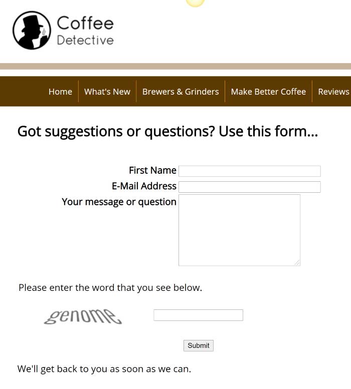
He asks just for the very basic information he needs so he can reply to the visitor. He even manages the visitor expectation on when they can expect a reply.
There’s lots of whitespace, a simple Call to Action “Submit” button and Nick gets right to the point with his “Got suggestions or questions? Use this form.” Clear, concise – no question what this form or page is about, or what he wants his visitors to do.
2. Greet Your Visitors with an Open Letter
Next, we have a contact form from Danny Sandrik of All-About-VinylRecords.com that goes to the other side of the spectrum. Danny introduces the website and form with an open letter.
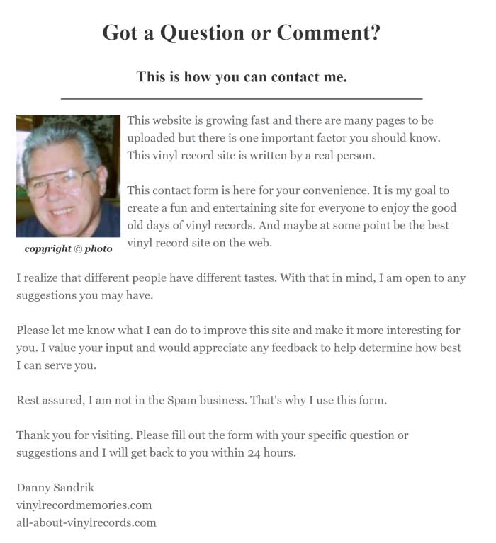
They both used the same fields on their form but the way they introduce the form is very different. With a contact form you have some leeway in how you want to present it.
Don’t be afraid to get creative — depending on whether you want to get lots of people to contact you… or not. You might design the form to complement your website, change the Call To Action text to better match your niche, etc.
Suggestions and feedback can really help you build out your website so it meets your visitor’s needs. Getting feedback from visitors means your website means enough to them to let you know what they think. That’s a real compliment.
3. Spruce up the Contact Call to Action with Images and Links
The Contact Page is one place where a variety of Calls to Action could work. Adding an image will draw the visitor’s eye. Also, offering alternatives or additional items can help to define the types of contacts you get as shown here with Richard Gorham’s Leadership-Tools.com website:
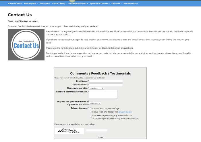
After the form, Richard provides links to pages he wants to promote to visitors as well as offering a free gift. Danny also offered extra links, comments, etc. after the form for those who read on. These offerings may help to reduce the number of repetitive emails you get from your visitors and still help them to find what they are searching for.
Offering links that answer more common questions such as an FAQ page is a good way to manage the number of submissions you get. Also, free gifts are always wanted by visitors — as much as you want subscribers to your newsletter! These would also be great Calls to Action to add to your Thank You Pages.
4. Guide Your Visitors with an FAQ Section
Here, Elizabeth O’Brien, of English-Grammar-Revolution.com, turns it around and starts her contact page with the FAQs she has gathered over the years. Then after the FAQ is the contact form. She really wants her visitors to at least try to find their answer before they contact her.
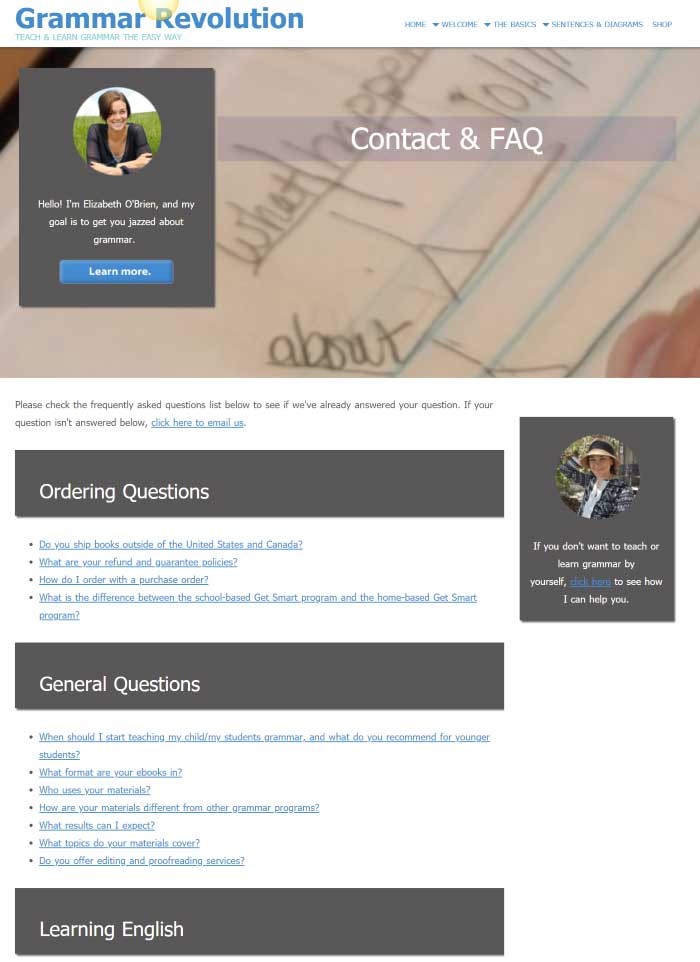
The FAQ is actually her primary focus, with this being her primary CTA:
“Please check the frequently asked questions list below to see if we’ve already answered your question.”
The second sentence is the secondary Call to Action and a link is provided to jump down the page to the contact form.
“If your question isn’t answered below, click here to email us.”
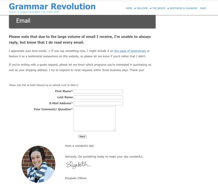
She asks for mostly basic stuff but gives clear and direct instruction on what to expect and what she needs in specific instances. Also, the time frame within which she will respond (or if she won’t) is also detailed leading up to the form itself. Her Call to Action button (the “Send” button), with the form filled in, completes the contact page interaction.
Elizabeth used lots of whitespace in her page making it easier to read, and find, what one is looking for. Her friendly signoff is yet another personal touch to make the visitor feel special.
A Contact Page can be as simple or as detailed as your website needs. It will evolve over time as you get more and more submissions.
Newsletter Sign Up Call to Action: Four Examples of Signup Forms That Work
Your newsletter Call to Action has a single purpose: get as many of your visitors to sign up to your list as possible. If you aren’t happy with your signup conversion rate, read on. You’ll find out what these fellow online business owners have done to increase their signup rate.
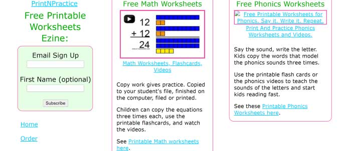
5. Go from Bland to Sparkling
Mary from printnpractice.com started out with a simple newsletter signup form in the left side column. She found subscribers increased when she placed the signup form at the top of the left column.
When an Exit Intent Modal element for Solo Build It! was introduced, Mary decided to try it for her newsletter. This is what she came up with:
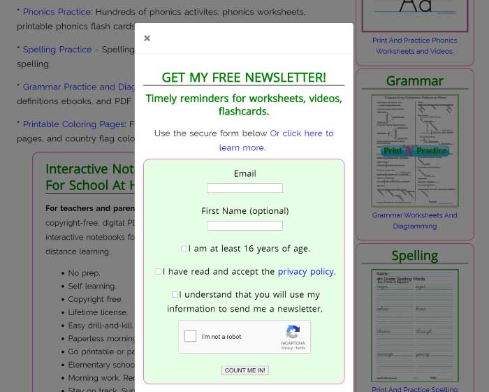
Mary added a stronger support for the Call to Action with a larger headline and included action words and power phrases. Changing the Call to Action button from “Subscribe” to “COUNT ME IN!” gave the CTA more punch. The extra whitespace also contributed to the professional appearance of the CTA.
All in all, Mary went from bland to sparkling with the changes to her newsletter signup form including changing the location from sidebar to an Exit Intent Modal. When asked if the changes improved subscriber stats, Mary said,
“The newsletter modals on my sites are producing so many email sign ups, nearly as many since I’d put it up (a year and a half?) as I’d gotten in nine years.”
Mary’s tip for everyone on trying something new?
“Give it a try. I had no idea that I could increase sign up rates like this.”
6. Tell Your Visitors Exactly What They Get
Cath from Raising-Happy-Chickens.com also uses an Exit Intent Modal for her newsletter.
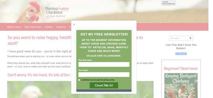
She then goes on to include the features in a quick paragraph so prospective subscribers know what the newsletter has in it. Cath added a link to her dedicated newsletter signup page to “CLICK HERE TO LEARN MORE!” and closed with a strong Call to Action on her button with “Count Me In!”
Cath also asks for just the minimal information needed to send the newsletter, including the first name so she can personalize the salutation for each subscriber, which has been proven as an email marketing best practice.
When asked for a tip on newsletter sign up forms, she said,
“Be honest about exactly what people can expect when they click the CTA button, whatever it’s for – otherwise they just unsubscribe quickly (if it’s something like a newsletter) or worse, report you for spam.”
7. Use a Powerful Left Column/Exit Intent Newsletter Signup CTA Combo
Gerhild from quick-german-recipes.com offers a walk-through of the various newsletter sign up forms she has used over the years.
“The freebee was a chart of ‘Herbs & Spices in the German Kitchen’ … I think the word “chart” was added to a later version of this signup form. It was in my left nav bar and I also had a full-page signup form on the site.”
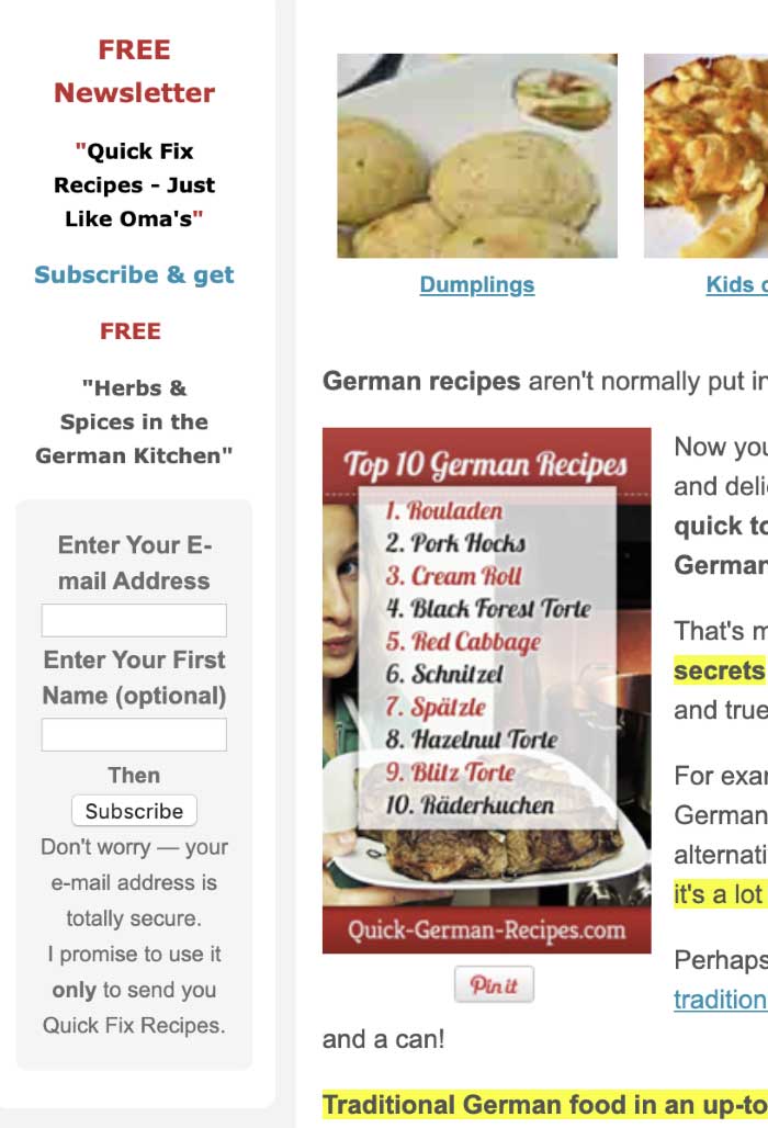
When Gerhild switched to Aweber for her newsletter and email management, she put this form in her side-column.
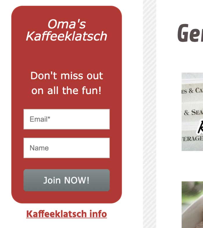
In addition to the signup form in the left column, Gerhild uses an Exit Intent Modal.
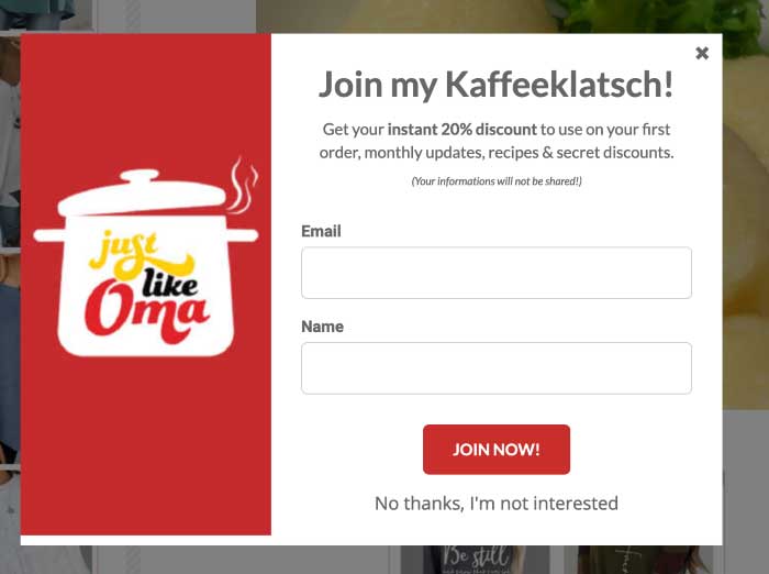
Gerhild provides not only a strong headline, features for joining, and a strong Call to Action, but also includes her rebranding of Quick-German-Recipes.com to include her “Just like Oma” logo.
The logo draws the eye to the important elements of her Call to Action, and makes this modal stand out!
The secondary Call to Action is below the primary CTA in a smaller font where clicking the link “No thanks, I’m not interested” closes the Exit Intent Modal.
What does Gerhild think is the single most important thing about your CTA?
“Just do it! Don’t put it off. Just start and you can always change it and make it better.”
8. Pack in Power Words, Images and a Free Gift

Ian Morton from All-About-Houseboats.com uses a unique side-column ad for his newsletter sales page. It takes up most of the side-column, he calls it a “magazine” not a “newsletter” and it uses an animated gif that points repeatedly to the free offer.
Honestly? I hate animated gifs, they are distracting. But here, Ian uses the distraction to point to his offer. That’s clever and adds an element of fun. The gif is simple, not overdone with multiple colors and multiple gifs. Just one, black and white … and it’s cute.
He starts out with the headline and his offer of a free gift, “Grab Your Free Gift.” Grab is the Action Word and Free Gift is a Power Phrase. Combined, they pack a punch.
His smiling face and linking to his About page, helps build trust. Who wouldn’t trust this guy?
The offer headline stating what the free gift is and a short paragraph packed with benefits and power phrases … Stay Updated … Get the real hard facts … you want and need to know … now.
The ad finishes off with the cover photo of his digital magazine encouraging readers with the same action and power-packed words he used in the paragraph above the image. Tying that together just reinforces to the reader how important it is to get this newsletter — NOW.
Now why am I suddenly interested in houseboats? Hmm.
What Can You Do to Improve Your Contact or Newsletter Signup Forms?
Take a critical look at your contact and newsletter signup forms, especially if it’s been a while since you created them.
Does the contact form clearly state why you want the reader to contact you?
Does the newsletter signup form clearly state what’s in it for the reader when she signs up?
Are there any elements that distract from your most wanted response?
Can you improve the wording on the CTA button?
Don’t forget to test! Make one change and test its impact. Did it improve the signup rate?
- If Yes, test the next change.
- If No; revert back to the last version.
- Rinse and repeat!
Over to you… show us your Call to Action examples.
We’d love to see what you’ve done on your website or blog. Take a screenshot of a CTA example you are currently using and post it in the comments section.
What’s Next for CTAs?
Look for coming articles on other types of Calls to Action including webinars, ecourses, ebooks, lead generation, dedicated sales pages, and more in the next couple weeks. You won’t want to miss those proven Call To Action examples!
“The difference between try and triumph is a little umph.”Marvin Phillips


Latest posts by Debs Seeber (see all)
- 15 Call to Action Examples That Are Proven To Work - January 22, 2021
- 8 Call to Action Examples to Fire Up Your Marketing - June 9, 2020
- 7 Strategic Ad and CTA Placements for Maximum Impact - May 26, 2020
