

Have you ever wondered where to place ads on your site to get the best return from them?
Whether it’s Google AdSense, an affiliate link or an “ad” for your own products, the location of the ad on your website plays a big role.
 Your web real estate is valuable, especially as your traffic builds and more targeted visitors come to your website.
Not only is this important because of the income the website produces now. It also ties into your exit strategy. The more income your website generates, the more valuable it becomes should you ever decide to sell it.
To help maximize your income, every advertisement on your website needs a strong Call to Action (CTA).
How important the Call to Action is for your bottom line will determine where to place your advertisement and its CTA. An ad for your own product or service is more important than an AdSense ad, right?
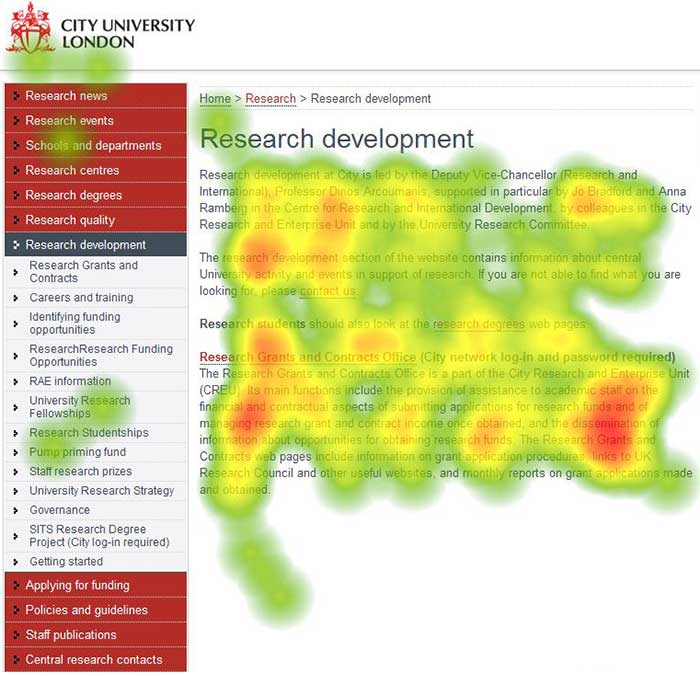
“Heatmaps are a powerful way to understand what users do on your website pages—where they click, how far they scroll, what they look at or ignore.”Hotjar.com
Over time, you can use a heatmap of your website to experiment with placement and ad adjustments to improve conversions. To help you get started, we’ve put together these seven strategic placement suggestions, complete with real life examples from Solo Build It! online business owners.
1. Advertising Within Your Content
These might be textual links within informational content as shown on Margit Streifeneder’s Balloon-Decoration-Guide.com home page:
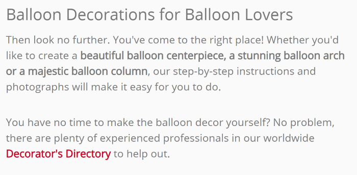
Her advertisement includes the entire second paragraph. The Call to Action is the link itself. The power phrases include “no time,” “experienced,” “worldwide” and “to help out.”
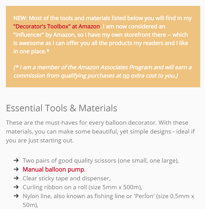
Here’s another example from Margit’s website. It’s an ad disguised as a helpful tip. Shhh, don’t tell anyone! It starts with, “New: most of the tools and materials…”
2. Advertising in a Sidebar
Another common area to place a Call to Action on a website is the sidebar or side column. The top of the sidebar or side column is a premium placement when compared to anything in the middle of the sidebar or side column. The bottom of the sidebar is also a premium placement when it’s a sticky ad that rides in place (sticks at the top of the window) when scrolling farther down the page.
Mike Miller of Florida-Backroads-Travel.com uses Mediavine Contextual Ads on his site. Mediavine has placed an advertisement at the end of the left sidebar. It’s a sticky ad that will stay in place as visitors scroll down the page, as shown below:
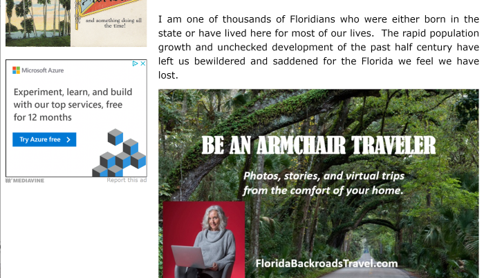
The end of the ad meets the “Be An Armchair Traveler” image in the content area. The ad becomes a sticky ad as visitors scroll down the page and will retain the position as the top of the sidebar.

As I scroll down the page, the Microsoft Azure ad is now at the top of the screen view, but at the bottom of the Florida Backroads Travel image.
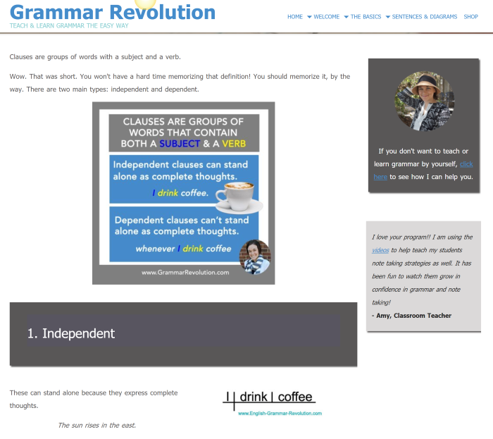
In the next example, Elizabeth O’Brien of English-Grammar-Revolution.com places an advertisement for her own “Get Smart Grammar Program” at the top of the right-side column. This advertisement runs almost sitewide.
The ad location is a good placement as it’s at the right tip of the first horizontal stripe in the “F-shaped Pattern” for eye tracking as tested by the Nielsen Norman Group. This basically means that it’s a highly-viewed area where you might want to place something important.
3. Advertising Within or Next to Your Navigation
Gerhild Fulson from Quick-German-Recipes.com has an ad bar under her header. Visitors will be looking for navigation on any site they visit. Since the ad mimics the look of navigation, it will capture a lot of attention. It’s a top placement for the “F-pattern” too.
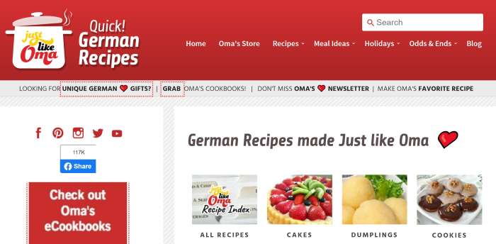
Located right under the header at the top of the web page, this prime placement, and the discreet way the information products are presented, is different from the usual self-product ads I’ve seen recently. Definitely something to consider.
Richard Bergman’s DecksGo.com includes an implied Call to Action in the mega-menu to his own free deck plans. A mega-menu is a more advanced version of standard or automatic navigation menus.
A mega-menu is an extra tall navigation menu, which allows for images, extra text and links. These can be standard navigation items, as well as space to promote your own products and services.
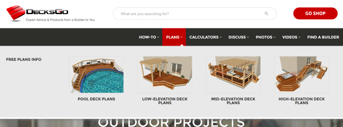
As you can see, the “Plans” section of the mega-menu shows images with identifying text of the categories offered.
I’ve seen a lot of different types of products offered via mega-menus. In some styles you can even do an entire ad in one part and navigation links on the other side of the same screen.
While great on desktop, these types of menus aren’t great on mobile. Plus, you need a bit of comfort working with HTML and CSS to maintain them. My suggestion is to set this type of navigation for desktop view only if you want to use it.
4. Advertising at the Top or Bottom of a Page (Header or Footer Area)
Since the header area is usually the first thing to appear to your visitor, it’s where their eyes first hit and pause. Including some type of Call to Action there makes sense for that reason alone.
A self-advertisement in the header and/or footer area of the web page might be a newsletter signup Call to Action or a form, join button, or other enticement.
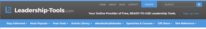
Leadership-Tools.com has a “Sign up now” Call to Action button in the header, as shown below.
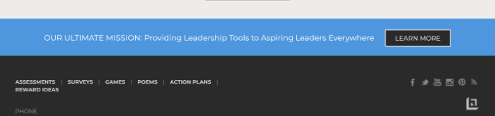
Placing some type of ad at the bottom of the page (near or in the footer) is another spot to consider. Here Richard Gorham of Leadership-Tools.com includes a full width ad that links to his Donation web page. It sits right above the black background of the footer.
5. Advertising After the Conclusion of an Article
Usability studies show that the spot after the conclusion of the article is another prime area to place advertisements. The reader has finished reading the page, or at least skimming it, and is ready to move on.
You could include links to other pages on your website, hoping the visitor hangs around and reads more. Or you could place advertisements to your products or the products of third-parties, or any combination of the three. I don’t recommend more than three items however. More than three can easily overwhelm the reader.
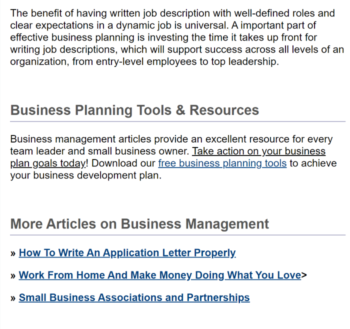
Here’s the conclusion of an article from Leadership-Tools.com. Richard used two groups of links to promote other pages on the website. Separated by a headline, this keeps the reader from being overwhelmed since the two groups are on different topics, and displayed differently from each other (inline paragraph and as a list).
This location is also a popular spot for larger contextual ads (Google Auto Ads, Adsense and Mediavine, etc.) to appear, which can increase earnings.
6. Using a Welcome Gate to Advertise
“[A] welcome gate hides the content of the web page with a fullscreen call to action. This forces the user to interact with the CTA before viewing the intended page.”ElegantThemes.com
A Welcome Gate can hold any type of self-advertisement that you would like, from products to newsletters, except contextual ads (like AdSense, Mediavine, etc.). Before attempting to place contextual ads within a Welcome Gate, check with the advertising platform that it’s allowed first.
When reviewing SBI! member sites, I’ve seen newsletters, specific products, and even specific pages related to or on the website used here. This is one example of a Welcome Gate. I’ll show more Call to Action examples in the third article in this series.
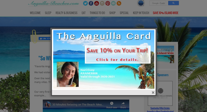
Nori Evoy of Anguilla-Beaches.com advertises her “Anguilla Card,” which gives users special discounts on their vacation in Anguilla. This was the first Welcome Gate Nori had used on her site.
You can see what looks like a gray film overlaying the website itself. Visitors won’t be able to do anything on the site until they interact with the Welcome Gate.
Nori wanted her visitors to know, as soon as they landed on her website, that they could get a discount on their trip if they had the Anguilla Card.
I will, however, add caution about Welcome Gates. These are considered among the most disruptive ads you can show a visitor. They not only interrupt the flow of how visitors traverse a website, you’re forcing them to respond to a Call to Action when they have likely not even seen your site yet.
For the above reasons, carefully consider which products or actions are worth the disruption.
7. Using an Exit Intent Modal (EIM) to Advertise
Popular options for the EIM include setting it sitewide, for a particular page or for a group of pages.
For example, your most wanted response on a dedicated product page is to sell that product. So your Exit Intent Modal could offer an extra discount on the product if the visitor buys it right away.
Alternatively, you could ask them to sign up to your newsletter. This allows you to stay in touch and promote the product in a future issue. According to Forbes.com, it takes 7 to 10 “touches” before a potential customer/visitor turns into a customer.
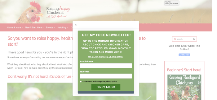
This example from Cath Andrews of Raising-Happy-Chickens.com is an Exit Intent Modal promoting her newsletter. It shows that the overlay has the “shaded” look where the website itself appears less bright than normal, the same as the Welcome Gate.
Here’s another example of an Exit Intent Modal from Ashley Cotter-Cairns of SellMyComicBooks.com. Ashley gave an easy way out of viewing the updated Top 100 with a simple “No Thanks” button to the right of the Call to Action button.
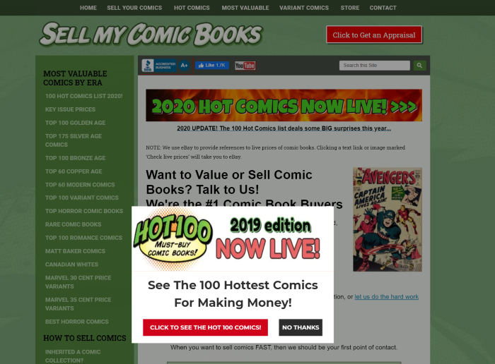
Ashley used the EIM very well by showing an announcement for an updated version of a popular page on his site. One sure to have visitors hot-footing it over to read the newly updated version. With an enticement of “See The 100 Hottest Comics For Making Money,” who wouldn’t?
Location, Location, Location
Location is just a part of the conversion equation when placing advertisements on your own website. And, again, you need to test locations, just as you should test the ads themselves. Once you have an advertisement that performs well, test different locations to see if you can improve conversions even more.
Which of these seven ad and CTA placements do you currently use and how? I would love to know. Simply leave a comment below.
And stay tuned for part 3 of our Call to Action series next week where I show you even more examples, tips from successful solopreneurs, and more…
“It’s not what you sell that matters as much as how you sell it!” – Brian Halligan, CEO & Co-Founder, HubSpot

Latest posts by Debs Seeber (see all)
- 15 Call to Action Examples That Are Proven To Work - January 22, 2021
- 8 Call to Action Examples to Fire Up Your Marketing - June 9, 2020
- 7 Strategic Ad and CTA Placements for Maximum Impact - May 26, 2020
