
The Ultimate Compendium of How to Enhance an Online Article Visually
40,000 years ago, humankind was in love with pictures…

Cave pictures. Whenever we ancient humans found a natural formation of rock that provided some degree of shelter, we’d draw all over it like a New York City graffiti artist.
The primal need to communicate with others visually hasn’t changed much, if at all, in the intervening years. And never has that been more true than in your online content.
Whether you’re publishing pages or blog posts for your online business, your readers require visually interesting elements to keep them engaged throughout your piece. One long blob of text just won’t cut it.
Why?
For one thing, our brains aren’t wired to enjoy reading plain text. Online, folks tend to scan rather than read. The human brain processes visual information 60,000 times faster than plain text.
We simply respond and relate better to visual information.
So if you want your readers to react positively and deeply to your content, include more than just text.
This post covers powerful-but-DOable options for presenting your information and content in visually arresting ways. Then we dive into some really advanced and (sometimes) highly technical methods.
Let’s dive in!…

BASIC VISUAL INTEREST
These are what one might call the “essential elements” of virtually every piece of content for an online business. If your page or post is lacking these, there must be a specific reason why.
- Featured Image — Whether at the top or somewhere near the top, every piece of content today requires an image that “represents” that article and helps the reader to understand the overall message. Ideally, the first image will be branded and include descriptive text on it, and will be followed by additional images sprinkled throughout the text. (More on that in a moment.)
- Paragraph Breaks and Whitespace — While subtle, the use of paragraph breaks and whitespace can help the reader move through your content and deliver additional emphasis to your text. Keep paragraphs short and activate the “voice.” In other words… Make your point and move on!
- Headings — After your initial headline or page title, break up your content into sections and use subheadings to indicate to readers that they’ve reached a new section.
When formatting your headings, always reserve H1 for your title and use H2, H3 and H4 in a decreasing hierarchy. Like this:
H1 – Page Title
H2 – Point #1
H3 – Example #1
H3 – Example #2
H2 – Point #2
H3 – Example #1
H3 – Example #2 - Lists (Bullets or Numbered) — Put a series of comments or items into a list. Bullets or numbers (like this one) help the reader to scan your content as well as provide understandable formatting for text. So… Break a long comma-separated “list-sentence” into a more readable “list-list.”
Now that we’re warmed up, let’s move on to the more challenging techniques.
ADVANCED VISUAL INTEREST
Strictly speaking, these elements or techniques aren’t required for online business content. But including additional images go a long way toward grabbing and keeping your reader’s attention.
Charts & Graphs
Remember: “images” doesn’t only mean pictures.
Charts and graphs exist to make it easier to explain and illustrate numbers and trends. Use them!
If you’re presenting a series of numbers, consider how you could turn them into a graph. And if you have just one or two numbers, consider how you might add more data to a graph to make your point even stronger.
For instance, what if I told you that, according to Andy Crestodina’s study, more bloggers were using multiple images in their posts in 2016 when compared to 2015? Doesn’t this chart convey that information even more effectively?
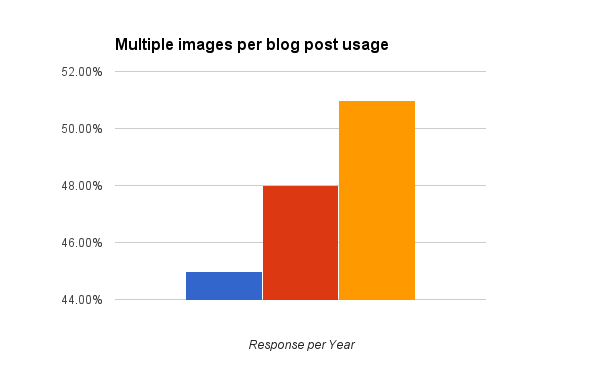
See how fast the trend is rising over the last three years? A table of numbers/years would have lost most of the impact. And charts like that are relatively easy to create.
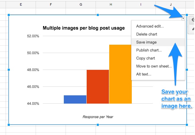
I used a Google Sheet to enter the data, highlighted it, and used the built-in Chart feature to select my chart type and customize it. Canva now also includes charting capability for even more stunning images.
Screenshots
Show, don’t tell.
When appropriate (ex., when explaining a step-by-step process), screenshots can prove invaluable. It’s the next best thing to explaining it face-to-face.
Whenever talking about an app in an article, I always use my iPhone’s Home and Lock buttons to take a screenshot that I can then embed on the post.
For more complex and interesting desktop screenshots, I use Skitch from the team at Evernote. Skitch allows me to capture specific areas of my screen, as well as timed screenshots, and then mark up those screenshots with text and graphics to help illustrate the point.
Infographics
Infographics take charts and graphs to the next level. They provide a creative arrangement of a great deal of information in a very specific, choreographed way.
Good infographics tell a story as you progress down the graphic.
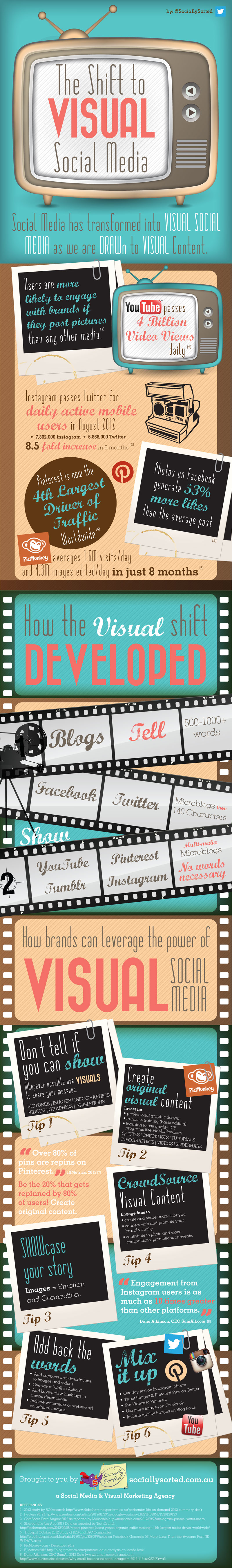
This infographic from Donna Moritz of Socially Sorted illustrates the evolution of visual media in an interesting way, which leads the reader into the story.
Custom Graphics
Sometimes there are opportunities where an image would really help to emphasize a point you’re making, but no such image exists.
No problem. Create a custom graphic!
Canva, PicMonkey and Adobe Spark are all excellent tools for creating graphics with little to no budget.
Here’s one that I created within Canva to help illustrate how a content pyramid works:
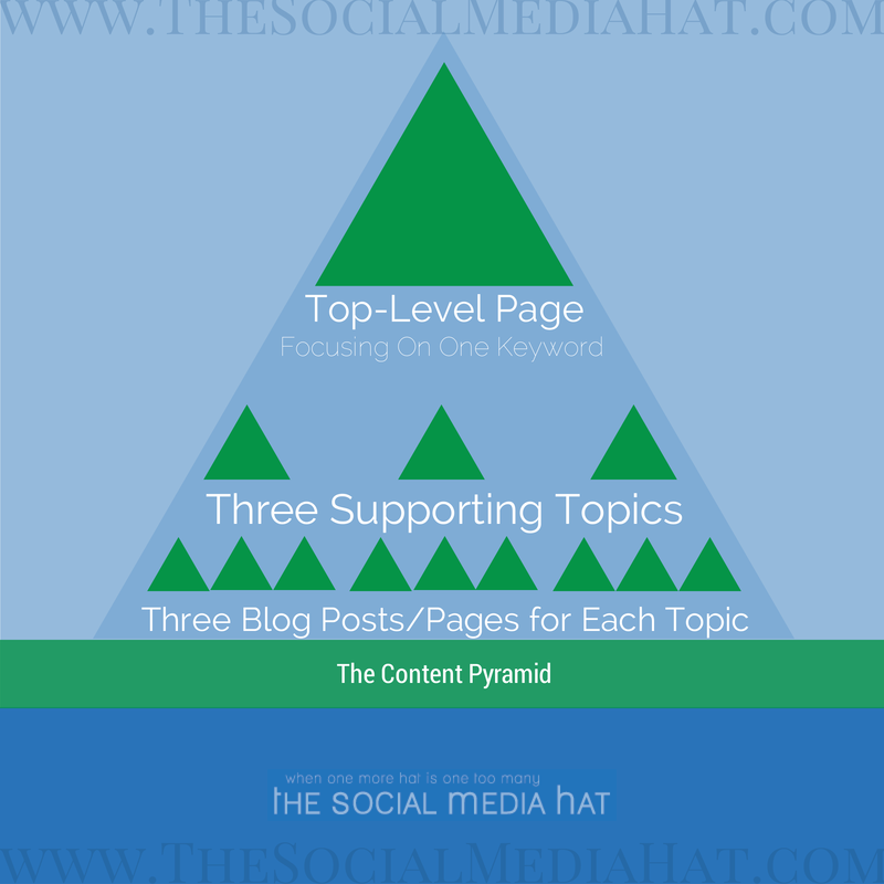
This online business structure is similar to the three-tier approach outlined in the SBI! Action Guide, but tailored for bloggers.
GIFs
GIFs are animated images, which means they’re able to communicate more within a few frames than your standard static image.
More importantly, GIFs are commonly used to inject humor into content and should be used whenever appropriate for that purpose. I suppose I really should tell a bad joke now…

Quotes
“Quotation, n: The act of repeating erroneously the words of another.”
― Ambrose Bierce
Quotes, particularly when they’re formatted to stand out from your regular text, can be very effective at getting the reader’s attention and reinforcing a point.
This humorous quote from Bierce, for instance, suggests that we shouldn’t use quotes at all, because too often they misrepresent the meaning given by the person who wrote or spoke them. It’s an interesting juxtaposition from the point I’m making…
There are loads of quotes about quotes, but this one made you to stop and think, right?
Bierce’s point is well made, too. It would fit wonderfully in a piece about the dangers of quotes. So I leave you with this caveat…
Quote and cite the author correctly when sharing someone else’s sentiments. Make sure you really understand lesser-known quotes or you may shoot yourself in the foot with it.
Pull Quotes
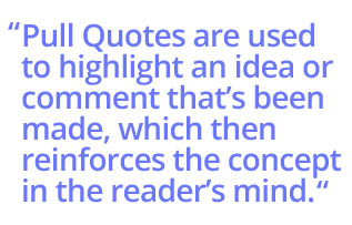 A pull quote, on the other hand, is drawn expressly from the content itself. It’s used to highlight an idea or comment that’s been made, which then reinforces the concept in the reader’s mind.
Pull quotes can be plain text formatted differently or, more commonly, a quote graphic.
Note that the text of the pull quote repeats what’s been said within the normal body of text, though slight modification for context is certainly permitted. When italics don’t emphasize a critical point strongly enough, try a pull quote.
Click To Tweet
A click to tweet is an express invitation to the reader to click a link or button that then automatically generates a tweet of the indicated text. For example:
Click To Tweet invitations are most effective when used to share dramatic statistics, poignant quotes, or startling conclusions from the text. To maximize response, use the kind of information that will make the tweeter look smart for sharing.
To create a Click To Tweet:
- Go to https://clicktotweet.com and click Basic Link
- Type or paste in the text you want shared.
- Add a link to your piece of content and make sure that you’re under 140 total characters (120 is better — it leaves room for others to retweet the entire message).
- Click Generate New Link.
- Use the provided link to make the text or button within your content linked.
And that’s it. Simple! You can add nice formatting if you wish, or just put (tweet this) in parentheses.
Note that it’s best to limit to 2 – 3 Click To Tweet invitations per piece of content. Studies show that after a third, participation drops dramatically.
Sidebars / Takeaways
Another technique we love to use in the SiteSell Blog, articles and forums is the sidebar or takeaway.
The idea is simple. Some simple css-formatting highlights and differentiates a piece of text. It’s often used for a piece of content that is appropriate, but that would have broken the flow of the main text (ex., a supplementary piece of related content).
Start a new table within your content and choose to use a single row and single cell. Insert your text and then change the background color and text color to be very different from your normal text. White text on a black background works well, for example. Ideally, you’ll decide for yourself a set pattern that still fits with your brand colors.
If you use WordPress, you may have a box shortcode available.
This is also particularly useful when you want to interject a thought into your content, making it obvious that it’s different from the surrounding text, but still important.
Related Content Links
Inserting related content links throughout an article to other pages and posts from your site is important. It widens and deepens the topic, also provides opportunities to link visitors deeper into your sales funnel. And yes…
We’ve used the technique in this sentence (you really should consider SBI! for your online business).
By the way, emojis are a “micro-visual” way to break up text. They’re usually more appropriate in emails and social media, but what the heck I needed to mention them in this article.
Instead of simply hyperlinking text within an existing sentence, we’re going to call out a related article and make it very obvious that the reader should check it out, like this:
Returning to our more serious tone, there is a second strong format for related links.
| RELATED: Your Online Business Structure: Tiers Without Tears
Readers who are interested in learning more may come back to that link, or even open it in a new tab (to be sure they finish the original article). That improves your time on site stats, reduces the bounce rate, further immerses your readers into your site, and adds a little visual variety to your text!
Table of Contents
If your article or blog content is lengthy and includes a good number of sections, consider including a table of contents (ToC) at the beginning. It helps your readers understand the scope of your article (as well as navigate down to specific sections of interest).
To create a ToC within HTML, you simply need to add an “anchor” for each section. After you’ve typed in the text for your ToC at the top, link each item to its respective anchor. (For those of you who use SBI!, BB2 has this capability baked in.)
Like this:
BASIC VISUAL INTEREST
ADVANCED VISUAL INTEREST
Charts & Graphs
Screenshots
Infographics
Custom Graphics
GIFs
Quotes
Pull Quotes
Click To Tweet
Sidebars / Takeaways
Related Content Links
Table Of Contents
Embedded Social Media Widgets
Embedded Social Media Posts
Embedded Video
Call To Action Buttons / Forms
Implementing The Sparks
Of course, your ToC should appear close to the top of your article. It is best placed after the introduction.
Style it as best fits. A vertical orientation takes a lot of space. Two columns can work. And a horizontal ToC takes almost no vertical space – it is a strong option when there are not too many items to fit on one line…
Charts & Graphs | Screenshots | Infographics | Custom Graphics | GIFs | Quotes | Pull Quotes
Use CSS to place it inside a box with a different color background. If vertical, use about 40% of the column width. Consider floating it to the right with your text wrapping around it. Or use two columns, 80% width and center the box. We’ll leave this part to your graphic designer because they always have THE way to do it. 😉
Sorry, couldn’t resist that winkie.
Embedded Social Media Widgets
Social media widgets provide additional interest and functionality to your content. They can vary from simple “Follow” buttons linked to your profile to automatically updating boxes showing your latest tweets.
Context here is incredibly important. Simply inserting a “Follow Me On Twitter” button into the middle of an article will have no impact at all. However, embedding a Pinterest Board full of Soup Recipes on an article sharing your latest soup recipe is highly relevant — and effective!
Other examples include recent tweets, Instagram posts, Facebook activity feed, and so on.
Embedded Social Media Posts
Even better than social media widgets is individual posts. They’re better because they’re typically more on point, and easier for your readers to engage with.
The most common example that you’ll see in mainstream media is embedded tweets. In fact, many of the “news” articles today are nothing more than a collection of related tweets on a particular topic.
While we don’t recommend that approach, embedding tweets and other social posts in your content is very effective.
Firstly, carefully chosen posts will add interest and variety to your content.
And secondly, by embedding the actual post (not a screenshot), readers can like, comment on and even share that post, right from your article!
Include videos in your #EmailMarketing to get a 55% #CTR increase
How to do it?https://t.co/zyCL8f7Qxm #blogtips #contentmarketing pic.twitter.com/ecbOqJZmCf— SiteSell.com (@SiteSell) 30 December 2016
You can embed anything from tweets and Facebook posts to pins and SlideShare presentations.
Embedded Video
Speaking of video… there’s no better media to embed in your content than a useful video.
Embedded videos may help readers understand your content better, or demonstrate actions.
Video can motivate, entertain and engage your readers like nothing else.
And, like the other social embeds we just mentioned, embedded video can have external benefits on the social networks you’re embedding from.
Suppose you have a video that you’ve uploaded to Facebook, and a related piece of content you’re publishing. If you embed the Facebook video post, each time people read your content and engage with the video post, they increase the visibility of that video to their own audience.
If you’re logged in to your Facebook profile and like, comment on or share that video post, your audience will see it (and appreciate it!). Each new engagement increases the reach for the post and sends positive signals to Facebook.
Call To Action Buttons / Forms
Finally, my personal favorite of all of these techniques: the Call to Action Button.
Plain text links are boring — and so 1999! Instead of a link, why not give your readers a beautiful button to help them see exactly what it is you want them to do next? It’s a technique no successful online business can afford to be without.
And it couldn’t be easier to set up. With a little bit of CSS, anyone can do it. I recommend creating a CSS Class within your style sheet called “button” that you can perfect and then apply to whatever links you want! Like this:
Simply set the attributes for background, color, padding, font-family and font-weight to whatever you want (and whatever fits your brand style). You can even set alternate styling for the hover state.
If you use WordPress, you most likely have button shortcodes (in various colors), so you won’t have to do any styling. Just enter your text.
Use these buttons for important CTAs at the end of posts, or even in the middle of posts!
Similarly, if you want readers to sign up for your email list or for an offer, whenever possible, include the form within the content. If you embed it rather than link to another page, your conversion rate will increase.
Implementing The Sparks
Now, should you do all of these in a single post? Not very likely. Like a great chef, the seasoning you use must be applied judiciously. Don’t pull every spice jar out of the cabinet!
Pull from this list. Use a mix of different ideas for different pages. For example, depending on the nature of the material, use a click to tweet and embedded Facebook post on today’s article, and a series of pull quotes and call to action buttons on tomorrow’s.
Through it all, make sure that the overall impression you’re leaving with your readers is one of excitement and engagement. These sparks should get their attention, fire up their emotions and imagination, stimulate their senses, enhance the content, and most importantly, keep them engaged with your text!
Whoops! No, that’s wrong. Let’s state that properly…
These sparks should
- get their attention
- fire up their emotions and imagination
- stimulate their senses
- enhance the content, and most importantly,
- keep them engaged with your text!
Wasn’t that easier to read?
We don’t think cavemen were selling anything. And they didn’t have letters, which is why they weren’t breaking up any text. But their imagery certainly got our attention.
Use visual breaks to do the same in the 21st century. Do it without losing sight of the purpose of the content itself. Enhance – don’t distract. If you can do that well, you will have succeeded in enlivening your content — and improving your online business into the bargain.
Naturally, there’s a huge bottom line to executing a good mix of these strategies in every web page. Consider a text-heavy page… Visitors shift from reading to scanning pretty quickly, even when you start with a strong headline and opening paragraph.
No matter how well you write up a particular topic, blending in an optimal combination of visual breaks will…
- stop the eye
- re-engage the reader
- keep them reading your carefully crafted words.
And THAT results in longer time-on-page AND a greater appreciation of the entire article. Delighted visitors send off all the right “off-page” signals (ex., links to a page, wider dissemination through social media, etc.). THAT brings us back to the core concept of improving rankings at the Search Engines by OVER-delivering.
As always, WOWing the visitor ultimately trickles down to improved search results. Using visual strategies should be considered almost as important as OVERdelivering on your written content.
Latest posts by Mike Allton (see all)
- How to Avoid Failure in an Entrepreneurial Business - September 23, 2019
- How to Use Buffer for Social Media Management: The Solopreneur’s Guide - September 15, 2019
- Wix Review: An In-Depth Comparison of 10,000 Websites - September 1, 2019
