

Learning how to create a landing page that converts can transform your website into a profitable online business.
Unfortunately, if you want to get results, you can’t whip one up in 5 minutes, as some advertisements claim these days.
Whether you’re creating a landing page in WordPress, using a page-builder, or coding it from scratch, there are 4 roles you will need to embrace:
- The business owner
- The designer
- The writer
- The usability guru
This article will show you how to master each of those roles as you put together an effective landing page.
While I cannot promise that you’ll design like Apple’s Jonathan Ive, or write catchphrases like a professional copywriter, I can show you how to make the most important decisions — the ones that will make the most difference — in the right order, regardless of your skills.
What Is a Landing Page?
 The term “landing page” is used in a fuzzy manner as a catch-all description of different types of pages in your blog or site.
The obvious definition: It’s any page that a visitor lands on.
Each landing page has a purpose (which you define), and that purpose determines the content you’ll write, how you’ll design the page, and how you’ll build it.
In this article, I’ll focus on two of the most often used and practical purposes:
1) The Home Page of Your Blog or Website
Your home page is the main landing page of your site. It’s the www.yoursite.com “index.html” page.
This type of page has the specific function of welcoming people to your site, and allowing them to quickly get an impression of your brand. It then provides a way to discover what you’re offering, and directs them to specific topics.
2) Advertisement Landing Page (a.k.a. squeeze page, top of funnel page)
You’ll create these pages as a destination from some form of advertisement or pre-selling that’s not on your blog or site. By this I mean that a user arrives on the landing page from an online ad, an email campaign, or even an offline ad (e.g., a radio ad).
The purpose of this type of landing page is to keep the user focused on a single product, offering, topic, or concept as you can see in these landing page examples.
These two completely different types of landing pages share (and require) a simple yet critical decision that’s far too often overlooked when building a landing page.
What Is Your Most Wanted Response?
 Most Wanted Response. Post a sticky with this term next to your computer right now. Make it your page-building mantra, the concept that guides every blog post, every page that you build.
Simply stated, your Most Wanted Response (MWR) is this:
What you want your reader to do after reading a page.
It’s usually one of four things:
- sign up for something (e.g., a newsletter, e-course, free webinar)
- buy something
- go to a “next” page
- post a comment
Clarity about the MWR is important because the page’s layout and content must work together to achieve this primary goal.
Your page could (and should) have a backup response in it. But that secondary response must not drive or diminish the layout or content leading to the MWR.
Keeping the Most Wanted Response in mind, let’s get into the specifics for the two types of landing pages. We’ll look at them from each of the four roles mentioned above.
Make Your Home Page Irresistible
You know what they say about curb appeal? First impressions? You got me at hello?
Within seconds of landing on your home page, your visitor should easily glean:
- what you are about
- what your priorities for their visit are, and
- how you will be helping them make the most out of this visit
Consider this the speed-dating part of this would-be relationship.
Business Owner: Establish Your Landing Page Priorities
As the owner, you want your home page to be inviting yet authoritative. You want visitors to the page to get to know you, and to start to like and trust you.
You’ll do that by ensuring that the content, the design and the usability are all playing well together.
You also need to decide which pages of your website you want to guide visitors towards, when they land on your home page. As the business owner, it’s your job to figure out which pages have the most value in converting visitors into customers — and make them a priority.
Designer: Aligning Home Page Design with Your Brand
As the designer, your job is to create an enticing and inviting design that keeps people on the page long enough for them to start reading the content.
I’m not going to get into the finer design details like the meaning of colors, why you shouldn’t use Brush Script or Comic Sans, or the emotional impact that depth of field and levels of gray shadow can have.
Selecting a template style is an exercise in practical appropriateness, with a dash of personality. Simply put, don’t wear shorts to a wedding.
For example, if your site is predominantly text based historical recounting British politics, you wouldn’t want to choose a colorful template that has a massive image above the fold…

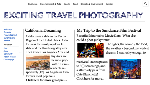
And if your blog is about exciting travel photography, you wouldn’t choose a three-column text-based template.
Any good builder will make customizing the design point-and-click easy. What you’re trying to select here is a template or theme that’s 80% of the way there. If you find yourself thinking, “I like this but would change this, then that, that, that, and that,” use a template that’s more appropriate.
Second, when selecting a template, make sure that the overall design will work with more than one arrangement of content (your text and images) throughout your site.
Writer: Home Page Content Tips
Keeping with my speed-dating example, as long as your date does not run for the hills due to your choice of attire, what you say will determine your potential relationship.
As the writer, you’re tasked with developing the content that will guide them through to the MWR, which, on the home page, is a link to a deeper page of the site.
Here are some tips on how to do that:
Make your headline style match your business offering.
For example, if your blog is about the challenges facing American midwest farmers, your main headline would not be “Swaggy Guidelines for Dirt Diggers.”
This seems obvious, doesn’t it? However, if you’ve spent any time on the web lately, it doesn’t appear obvious.
Let people know, right away, that they are in the right place with a headline that doesn’t leave them confused.
Create headlines that clearly state the direction of the copy below it, then lead them.
Too often, I come across a disconnect between the headline of a page and the content that follows. Unfortunately, in this bait-and-switch era, many misleading headlines are deliberate. But this condition exists in honest sites as well. Far too often, business owners try to catch-it-all, instead of focusing on a clear, single statement that entices the user to read more.
One effective method is to anticipate the reason the user is there, and craft your headline as a question…
Usability Guru: Simple Home Page Navigation
As the UX (user experience) expert, you ensure that the page is easy to use for all visitors. Here are some tips to help you do that:
Tell your visitor where to go next, then make it easy.
This is as simple as writing small single-purpose snippets of text, with a “Learn more” or “Click to subscribe” link or button next to it.
For example, if you have a splashy visual section on your home page, make sure that it’s followed by an equally splashy headline with the single biggest benefit. Then use simple copy that clearly defines what to do next.
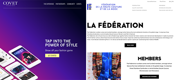
Here are two different examples from the fashion industry…
Make the main navigation clean, clear and consistent.
Your site’s navigation plays an often overlooked role in keeping your visitor interested and engaged.
You have no more than 10 seconds to grab and maintain attention. Your navigation must provide a no-need-to-scroll, single glimpse view of every major section of your site. So plan it to your advantage, and use it wisely!
Make each section name:
- Clean – as short a description as can be.
- Clear – there’s no confusing wording.
- Consistent – what they’ll discover after the click.
It’s also your job to ensure that the navigation and in-context links work, there are no broken images on the page, and there’s no sad YouTube face due to a non-existent video.
Ensure there’s lots of white space, sentence lengths vary (and none are too long). Paragraphs are short.
And an absolute must: You’ve checked that the page displays well on mobile devices.
You may have noticed that I use the distinguisher “main” above. Blogs and websites often have more than one type of navigation, in more than one location.
The use of secondary or sub-navigation for groups of topics is a good example of this on websites. On a blog, something like “Our favorite articles” is another.
There are good strategies on how to create properly constructed tiers or content clusters for your website, but that’s more of an architectural strategy that’s beyond the scope of this article.
If you would like to get some in-depth usability tips and strategies, we’ve always found Jakob Nielsen’s NN/g to be an excellent resource.
Create a Squeeze Page That Converts
 Sometimes called squeeze pages, you’ll use these landing pages to capture sales or leads. For example, landing pages are perfect for offering a free trial, growing your email list, or selling a product.
Business Owner: Choose a Single Purpose for Your Landing Page
As the business owner, your job is to decide what the page’s purpose is. Is it to sell a product? Is it to collect email addresses for lead generation?
Once you know the purpose, you’ll have a better idea of what you need on the page (e.g., an order form on a sales page, a signup form and some type of lead magnet to collect email addresses). You’ll also know if you need to invest time and resources to create bonuses for the product you’re promoting, or a lead magnet for email signups.
Designer: Create a Distraction-Free Design
The key to an effective squeeze-type landing page is simple — no distractions.
Your task as the designer is to design a page with no navigation menu at the top, no sidebar, and no set of links in the footer (except any that are legally required, like an affiliate relationship disclosure). There should be nothing that will distract the visitor from reading your message and taking the action you want.
The call to action must be easy to see, and the order button or signup button must stand out from the content and the background.
Writer: Writing Effective Squeeze Page Copy
Your job as the writer is to reassure and remove any doubt in the visitor’s mind.
The headline must immediately validate/reinforce why the visitor clicked to land here.
For example, if your visitor clicked on a link that read “Learn how to build the ultimate Lego house for free,” your landing page headline must clearly acknowledge that the visitor is in the right place to “Get the Ultimate Lego House-Building Plans for Free.”
Your content needs to quickly describe the offer, and “close the deal.”
Include at least one benefit. The more expensive the product you’re offering, the more benefits you’ll need to discuss. One to two sentences should do it for each benefit.
Continuing our example, your copy could list a benefit as “Creating quality time with your kids is easier when it’s fun for everyone.”
Usability Guru: Include Simple Landing Page Forms
Your MWR is for the visitor to click on a button to order a product, sign up for your newsletter or enroll in an online course. That makes a usable, and functioning, form an essential part of your landing page.
Forms are a usability topic unto themselves. We’ll keep it simple here, with these tips:
- Only ask for what you absolutely need — no one likes filling in forms. If all you need is a first name and email address for a newsletter subscription, don’t ask for their phone number and street address.
- Ensure that field labels describe exactly what you need.
- Abide by data privacy and consent laws that apply to you (e.g., GDPR, age).
- Make your call to action button big, colorful and clear. (I mention it here as well, as this is a usability issue as well as a design issue.)
If you’re building a landing page from scratch (you’re not using a landing page builder), I recommend that you create a template. If you’ve created an excellent design, you’ll reduce the amount of time it will take you to get your page live and making sales or signing up new leads.
Remember Your Four Roles as You Create Each Landing Page
Far too often I’ve come across pages whose design and purpose do not help each other. When building out your website or blog landing pages, create them with a purpose that’s reflected in the design, layout, and content.
This all starts with identifying and sticking to the primary goal — the Most Wanted Response — for the page.
Keep your focus right there while wearing each of the business owner, designer, writer, and usability guru hats. That will make creating landing pages a much simpler and more effective task.
Worried that you might not remember what you’ve just learned? We’ve got you covered. Download a summary of the landing page guidelines in this handy cheat sheet.
Latest posts by Margit Streifeneder (see all)
- From Zero to 1 Million Fans: A Community-Driven Success Story - October 16, 2025
- Six Figures on Her Terms: A Lifestyle Business Success Story - September 25, 2025
- From Sheds to Sales: A 20-Year Digital Product Success Story - September 11, 2025
