
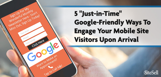
Intrusive pop-ups (aka “intrusive interstitials”) have become a thing of the past, thanks to Google’s algorithmic change for mobile rankings.
For a lot of solopreneurs, this is bad news. Many online business owners, like people who sell affiliate products or monetize their blogging, rely on CTA popups as an important source of conversions. This could be sales, newsletter signups, social media followers, and other actions at various stages of your funnel.
If you’ve been using interstitials heavily on your site, you’ll need to find a Google-friendly alternative that does what you need it to do, without being intrusive and creating a poor user experience.
Otherwise, you could be subject to a Google penalty, a risk you probably don’t want to take. Finding an alternative to intrusive pop-ups is one way for an entrepreneur to decrease risk in the face of the capricious and ever-changing whims of Google.
One option is “Hello Bar,” a lightweight tool that prompts visitors toward a CTA without getting in the way of your other content.
Is the “Hello Bar” a good alternative to mobile popups?
Let’s set the stage with a couple of quick introductions…
Say “Hello” to the Hello Bar!
Not heard of the “Hello Bar”? Or heard of it but think it’s a bit of a gimmick that can’t do much for your online business?
Think again!
The Hello Bar is a great alternative to the pop-ups you may have been using on your website, which are about to become a target for Google.
And while it’s easy to use as a sign-up mechanism…

…there’s a lot more to this simple tool than most people realize.
Let’s look at the Hello Bar in all its glory: not just what it is and what it does, but ways to use it that may never have crossed your mind.
And why even Google thinks it’s a good idea.
You Say Goodbye…
In its never ending quest to improve the search experience (and inconvenience marketers! ), Google never rests. In August 2016, they gave another warning that’s particularly applicable to mobile sites: “Intrusive Interstitials” will be punished. They have to go.
Human nature being what it is, many of us figured that we’d deal with it later. Well…
It’s “later!”⌛
So let’s get going…
“Intrusive interstitials”? What on earth…?
It’s easily translated. You have encountered “intrusive interstitials” countless times. They’re those annoying pop-ups that come out of nowhere when you’re trying to read an online article.
Sometimes they turn the content on the page grey so it can’t be read. Quite often, especially on mobile devices, they cover the article completely. Sometimes they even jiggle about, trying to distract you any way they can.
And they stay there, annoying you, until either you sign up for whatever they’re promoting, or you find the teeny, tiny “x” that closes them.
Popups may be effective for marketers, but for the site visitor, they’re often…
Just. Plain. Irritating.
Having said that, some of them are necessary, and some are actually OK with Google. Here’s a good article on the full details of the change.
If you do use an interstitial to receive your visitors and if it’s tremendously successful, you can always gamble and see if the value of a successful interstitial outweighs any loss in search traffic (if any – it’s not a major factor). Here’s Google’s official announcement.
For example, if an A/B-split has shown that this increases Conversion Rate by 20% and if your mobile traffic only drops by 2%, well, you do the math. This change won’t drop your traffic by 50%, so it’s not unreasonable to at least consider “doing nothing.”
For this article, though, we’ll offer a solid, zero-risk alternative if you do decide to “say good-bye” to interstitials.
…And I Say Hello
So What Exactly Is a Hello Bar?
First things first. Is the Hello Bar an intrusive interstitial?
The short answer is “no.” Because, used appropriately, it’s not intrusive. And it’s not an interstitial because it doesn’t “pop up” or otherwise dominate a landing page. It’s just there. And it’s a reasonable size.
Put simply, the “Hello Bar” is what it says on the label. It’s a bar that sits on your website.
It can sit anywhere you want it to sit. It doesn’t “pop up.” It doesn’t even jiggle about. So it’s not annoying.
And it does what it says on the label. It says “Hello” to your site visitors.
The trick is knowing what kind of “Hello” works best. More of that, later. First, let’s cover some basics.
1. Where can I find Hello Bar?
Easy. The Hello Bar website.
(There are other options available – SumoMe has a similar service, for example — but for the purposes of this article we’ll concentrate on the Hello Bar platform only.)
You can also download Hello Bar as a WordPress plugin.
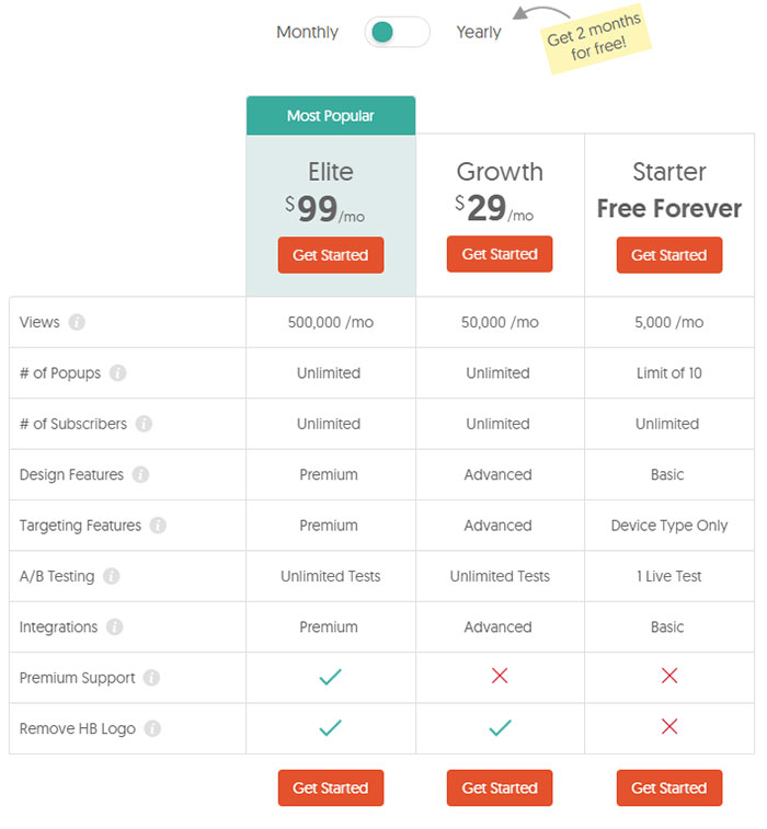
2. Hello Bar Pricing: How Much Does It Cost?
The basic version is free. The downside? You’re stuck with the Hello Bar’s own logo, the number of bars you can create is limited to 10, and ads are shown to every 1 in 10 visitors. But it’s certainly worth starting with this version.
Test it on your site. By the time you’ve run it for 3 months you should be able to tell whether you require the “Pro” version.
For that, choose to pay monthly or annually to get the benefits shown in this chart. Note in particular that only the paid version enables you to target site visitors. The free Bar is shown to everyone.
3. Is it difficult to set up?
No. Hello Bar’s instructions are straightforward. They guide you step by step through the whole process and make it as easy as pie — and just as yummy.
- Choose your color, text, size and goal choices.
- See the results as you work, on a live editor that shows a mock-up of your site.
- Change as necessary.
- Get the code.
- Place it on your website.
Job done.
4. What about branding?
You won’t be able to use your own logo or “thank you” page unless you have the paid version.
However, you can choose the color of your bar and the font type in the “content” section. Use your site’s color palette to make it either blend or contrast. Or choose from the Hello Bar’s templates, which are optimized to ensure greatest interaction.
5. Can it be used at the same time as a pop-up (interstitial)?
Not on the free plan. If you have the paid-for version, you’re able to add targeting options, one of which is that the Hello Bar is shown only to mobile customers.
So if you choose to go down that road, you can keep your pop-ups — if they’re working for you — for desktop views and add the Hello Bar for mobile only.
In other words, you’ll be able to have the best of both worlds!
How do I make the Hello Bar Google-friendly?
You have some choices in the “style” section, which may matter to Google or may not. But they can change the user experience, and that’s always the #1 priority.
Once you’ve signed up, clicking “Create a New Hello Bar” on your dashboard will bring you to this screen.
Fill in your initial wording to be taken to the “Style” screen. This is where you’ll spend most of your time.
-
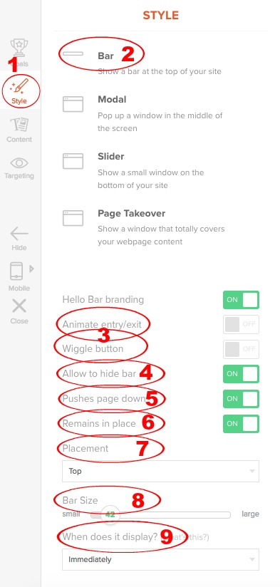 Find the Style section on the left navbar.
 -
Choose Bar: the other options are larger boxes, which may cover your content.
-
Animations: turn this on to make the bar “bounce” and the Call to Action button “wiggle.” Your choice, but although they may attract the reader’s eye, they’re irritating. Most leave the “animated” and “wiggle” buttons turned off.
-
Hide bar: this allows the reader to collapse the bar, rendering it invisible. It’s helpful on mobile devices and gives control back to the site visitor. Turn it on.
-
Pushes page down: turning this on leaves a small white space between the Hello Bar and your header. Turning it off means there’s no gap. This is a styling decision — choose whichever you prefer. The tiny bit of extra white space won’t make a noticeable difference to content placement.
-
Remains in place: keeps the bar at the top of content as your visitor scrolls down the page. This is the recommended setting — there’s evidence that the bar is more effective when it’s “sticky.” Of course, depending on how you use it, it could be more irritating, too.
-
 Placement: you can choose to have the bar at either the top or bottom of the page. Placing it at the top means site visitors see it as soon as they land. Putting it under your headline draws the eye even more quickly.
Having it at the bottom means it won’t be visible to visitors who never get that far. On the other hand, if they do, they may be more likely to engage. After all, they’ve just read some great content. Who wouldn’t want more?It’s a personal choice, based on your knowledge of your niche.
Not sure? As ever, test, test, test! Of course, it’s possible to have a Hello Bar both at the top and the bottom!
-
Bar size: this one is important. The slider enables you to make your bar larger or smaller. Don’t make it large — it will push content too far down the page, especially in small mobile screens (our primary concern).
-
When does it display?: this allows a time delay before the bar appears, if you want it. Would this be irritating to your visitors? Your call.
Hello Bar Example Uses
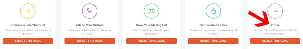
Now to decide what the goal of your Hello Bar is.
Wait — goal? Isn’t the goal to get sign-ups for newsletters, to generate leads, or to send folks to a sales page?
It’s true — most people use it for that. And that’s important — but it’s not the only possibility. And you’re not “most people.”
As you’re changing the way you get your site visitors’ attention, why not take some time to think about exactly what you want to achieve?
The Hello Bar takes just a few minutes to alter. Which means that in terms of how you use it, the world’s your oyster. What’s good one day can be quickly changed for something more relevant the next.
So before you rush into installing it, give yourself a few minutes to consider all the options. Here are some ideas for you to chew over.
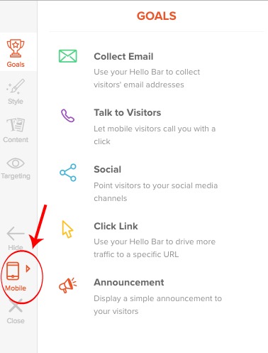
1. Use it as a simple notification.
For example, if your website will be down for maintenance, why not let your visitors know in advance? A few minutes to create one sitewide message can avoid a lot of frustration.
Or how about teasing an upcoming sale? Or a cheery seasonal greeting?
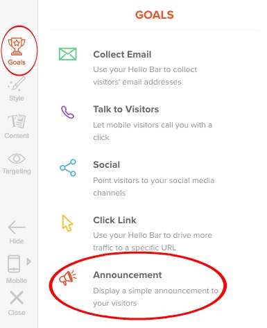 Use the “goals” section to choose “Announcement”…
… and the “Content” section to choose colors. Click on the bar to write and edit text. Images aren’t possible here, so now simply get the code and upload.
Advantage:
- Quick and simple to set up. Put it up for Christmas Day, “pause” it on December 26th. Or New Year’s. Or Diwali. Or your birthday!
Drawbacks:
- Space is limited, so this isn’t the place for a complex message. Use it instead to tease and link to your message.
- It’s not asking for or linked to anything, so you’ll potentially lose interaction for the day. That may not be critical, though, depending on circumstances.
If signalling events or sending holiday wishes could work for you, add set-up times to your marketing calendar now. It’s a quick and easy way to make sure the Hello Bar works for both your business and your site visitor.
Let’s take a look a more respons-oriented uses of the hello bar now…
2. Collect Emails.
 This is how the majority of people prefer to use their hello bar. Choose “Goals” from the navbar, then “collect email.” In the following screen, check “Email” as the required field.
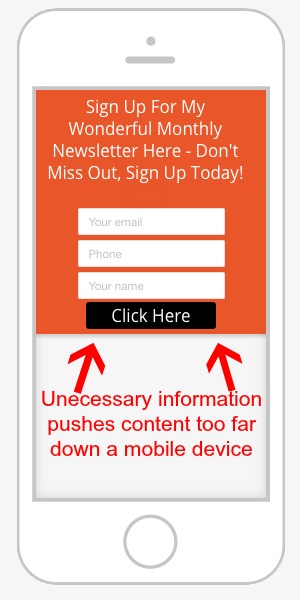
Add other fields if they’re important — you’ll be able to add a maximum of two others: “phone” and “name.”
As before, click on the bar itself to change the text in the message and field boxes, and the call to action (CTA) button. In the message and CTA text you’ll be offered some handy formatting options.
Use the “Content” section to change the bar’s colors.
As you change the look and feel of the bar, you’ll see it display on a mock-up of your site’s home page.
It’s particularly important to test this on the “mobile” view. Too much text and / or too many opt-in boxes can push site content too far down the page. And Google won’t like that.
Keep it simple.
The final step is to choose where you want your sign-up addresses to go. The Hello Bar integrates with most of the major email platforms. If yours isn’t listed, click on the link under the images.
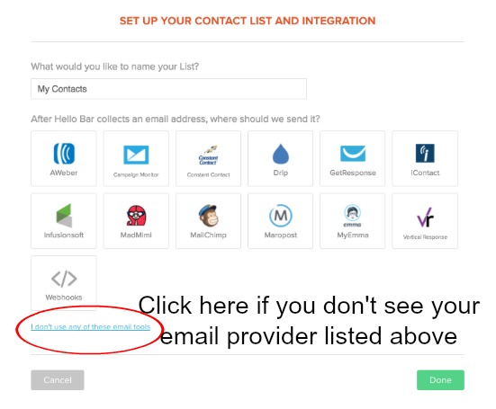
You’ll then have the option of collecting email addresses directly from the Hello Bar dashboard. Upload them to your own email provider.
Advantages:
- Easy to set up, particularly if your email provider is integrated.
- There’s growing evidence(3) that the Hello Bar increases sign-ups, even without a “freebie.”
Drawbacks:
- Uploading emails manually if your email provider isn’t included is an obvious issue. Depending on how many sign-ups you get it could be a long and tedious process.
- This option relies on site visitors being so blown away by whichever page they landed on that they want to sign up for your newsletter without any “sweetener.” Will yours sign up without a freebie?
- There’s no chance for you to outline the specifics of your newsletters, so visitors who sign up have no idea what to expect. That may cause problems down the line.
All these issues, though, can be fixed. Just use the Hello Bar a little differently…
3. Laser-focus attention: work those links!
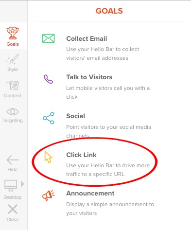 Send your visitor to a different page on your site — or anywhere else — using the “Click Link” option.
This is probably the most powerful option of all. You can use the Hello Bar to take your site visitor to any URL, anywhere you please.
Take a moment to think about that.
Anywhere. You. Please.
Where might that be? Consider some options — you’ll likely have others that spring to mind.
- Your sales page. Got a product to sell? Make your hello bar an important part of the final step of your sales funnel. Think imaginatively about how to make people want to click. What’s in it for them? What problem are you solving? What’s going to make their life easier?
And then of course — SEND TO SALES PAGE! — make your Call to Action button speak to them, too!
- Do you have a page dedicated to getting sign-ups for your newsletter? A page that tells exactly what to expect in your newsletter may be more effective than trying to collect addresses directly within the hello bar. Not sure? AB-split test both approaches!
- A “freebie” page, perhaps to persuade the site visitor to sign up for your email. Or to give away a “teaser” chapter of your latest book. She’s shown interest by clicking through from your Hello Bar. Now capture her interest still further with sparkling text and your great value freebie.
- Your latest article. It needs a bit of a boost until it starts to rank with the search engines. So drive traffic there. Throw a bit of love its way.
- Any other article to which you want to draw attention. A “Start Here” page. A seasonal page about Christmas in Germany. An article that includes a great new video you’re proud of. A page listing your opening times. A feature for that new office space you just opened.
- Are you looking to hire staff? Use the Hello Bar to advertise the fact. Link to wherever the job description is hosted.
You could even use Hello Bars to send folks “off-site”…
- Want to boost social media platforms? Add a link in the Hello Bar. There’s a specific plug-in link to Facebook — we’ll look at that below, since it has its own section.
For all other social media — at least at the present time — add a simple link to your Twitter / Pinterest / Google+ / LinkedIn/etc. account from the “Click Link” section.
- Or maybe a link to your latest Kindle book? Test a direct link to its sales page on Amazon.
- And how about a link to your Udemy (or any other) course? Udemy does a pretty good job of advertising it for you, and you mention it regularly in your newsletter. But if you have a high-traffic site, it makes sense to send your traffic to wherever your monetization happens, on-site or off.
- Are you a charitable organization? This is how Wiki makes use of the Hello Bar — would it work for you?
![]()
In summary, the linking feature is one of the major advantages of the Hello Bar. Take some time to think about where you most want your visitors to go — and then, link away!
Advantages:
- Being able to direct the eyes of your visitor wherever you want them to go is a massive bonus.
- The Hello Bar has the potential to become an active part of your monetization plan, leading the visitor straight into your sales funnel.
Drawback:
- None, really. If you link off-site, do it in a new tab or browser window.
4. Advertise your Facebook page.
You’ll find the “Social” section on the left navbar says “point visitors to your social media channels.” For the moment, only Facebook is integrated with the Hello Bar, but there’s clearly an intention to add more.
This section is self-explanatory. Encourage your visitor to “Like” you on Facebook, or to show their appreciation for the page they’re currently on.
5. Dial me up!
Want your site visitors to be able to call and arrange an appointment direct? No problem! Take a look at “Talk to Visitors” in the left column.
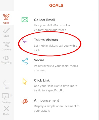
Add a telephone number from anywhere in the world. Simply enter the number in the first screen. Use the “style” and “content” screens as usual to add color and text.
The number itself isn’t displayed…
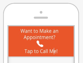
… the caller simply has to tap to be put through on his or her mobile phone. It’s that easy.
Advantages:
- Quick and simple for the user — no need to spend time searching out your contact details.
- The contact number doesn’t have to be yours. If you think you’ll get a lot of calls, try using a trusted third party.
- If you have a receptionist already, fantastic! If not, a Virtual Assistant may be less expensive than using a call answering service
Drawbacks:
- None, as long as you actively want potential customers to be able to talk to you direct!
Hello Bar Alternatives
Love the idea of Hello Bar, but not so much the product itself? (Or its pricing?)
Here are a few alternatives that offer similar functionality for non-intrusive, Google-friendly CTAs.
- Sumo Smart Bar: Brought to you by AppSumo, the Sumo Smart Bar is available for free, or as a Premium tier with extra features. Like Hello Bar, it features built-in A/B testing, included templates to choose from, and more.
- WordPress Notification Bars: This freemium option allows you to create unlimited CTA notification bars for your WordPress site, in a full spectrum of colors. You can also target the bars to different pages on your site, or even to different traffic sources.
- Top Bar: Top Bar lets you create sleek, minimalistic CTA notification bars.
Test, Test, Test
“If you can’t measure it, you can’t manage it.” Peter Drucker
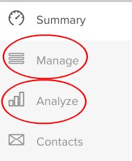 In dashboard view, the Hello Bar offers two important links:
- Manage
- Analyze
The “Manage” screen lists all your Hello Bars — active and paused. Use the gear icon to the far right to pause or delete.
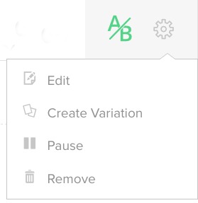 Click Create Variation in the gear icon’s drop-down lists allows you to set up a “variation” to the Bar.
Change goal, color or text, and the program will automatically split-test (A/B test) the two.
Testing gives you great information about what’s working — and what’s not.
That information is displayed right on the “Manage” page. It’s so easy to keep track of what’s happening.
Now use the link to the “Analyze” section.
In that screen you’ll see numbers of impressions for each Bar you’ve created, broken into goals. You’ll find an at-a-glance view by type, views, and % conversions.
Check it regularly. One option not working? Pause or delete it in the “Manage” screen.
Then try something different.
And Finally…
Because the Hello Bar is so quick and easy to install, there’s a temptation to throw one up and forget it.
Don’t. Spend time giving thought to what will work best on your site.
- As ever, remember your site visitor: What will be helpful to her? Answer the question: “Why will my reader care about this?” — Tell her how she’ll benefit.
- Balance that with your business objectives. Decide on one specific goal for each Hello Bar.
- Do you want it to do different things at different times of year? Devise a schedule to create and upload each version to your site.
- Test different colors, text, positioning, goals and calls to action. One size does not fit all.
- The Hello Bar offers a very simple way of A/B split testing. Use it.
The Hello Bar is awesome. Used properly, it’s eye-catching but not intrusive. It’s flexible enough to handle many different types of message.
The paid version can target specific groups. And the stats it gives are enough to allow you to find out exactly what works for your visitors, in your niche, on your site.
The world really is your oyster with this feature. So get to it — go create some pearls!
Cath Andrews
Latest posts by Cath Andrews (see all)
- Start a Passion-Based Business and Live Your Dream - February 1, 2023
- What Do You Say When Their Eyes Glaze Over? - December 20, 2021
- How to Monetize Your Email List in 5 Simple Steps - October 26, 2021
